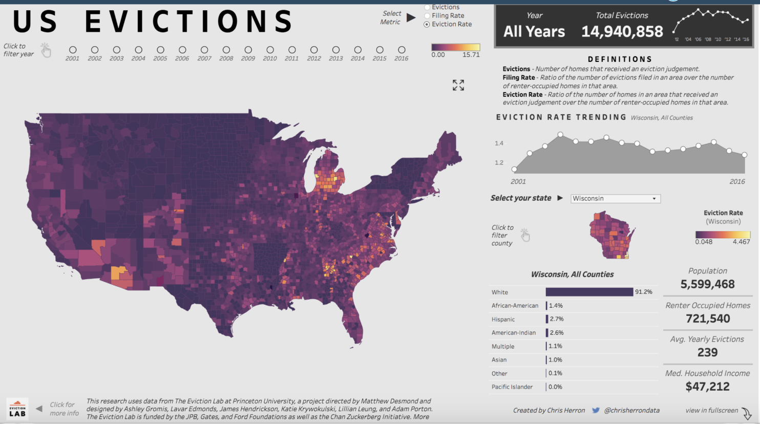
Chris Herron has published an online visual/infographic on U.S. Eviction History via the platform Tableau Public. He bases the visualization on data gathered by the Eviction Lab at Princeton University — which is a valuable source of housing law and needs data.
A Beginner’s Guide to Making Infographics
Here’s an excellent article from Rachel Banning-Lover on The Guardian, intended particularly for NGOs and relief workers, via the Global Development Professionals Network | Guardian Professional. How to make infographics: a beginner’s guide to data visualisation An interactive map of attacks on health care in Syria – the blue spots show attacks by government forces. Photograph: Physicians for Human … Read More