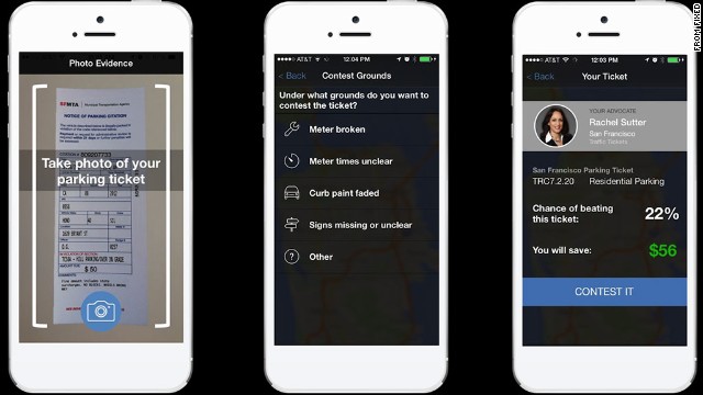
Set up your own text-messaging service for free. « SMS 411. If your legal design project may involve texting, particularly to ‘non-smart’ or dumb phones, then TextMarks may be a useful development tool to prototype an automatic texting system. You don’t have to be a big company to set up a text-message auto-response system. With TextMarks, you can set up … Read More
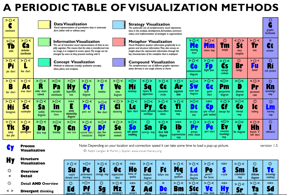
A Periodic Table of Visualization Methods
A Periodic Table of Visualization Methods. from Ralph Lengler & Martin J. Eppler at www.visual-literacy.org This interactive table presents a systematic overview of tools to use when trying to visualize different things — and hover over any of the types, and see an example of exactly that pop-up. So cool & useful!
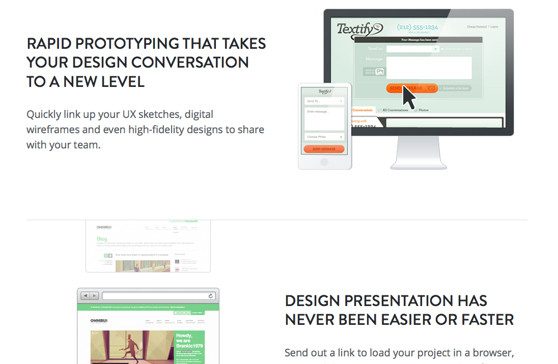
InVision – Prototyping Tool for Mobile & Web
InVision is a great (and free) tool to use to go from sketches or mockups to an interactive website. It lets you lay out your screens for a website or tablet/phone, and then hyperlink them to each other. Then you can invite users to click through & give you feedback. It prevents you from having to code up a site … Read More
Visualization for Lawyers
Welcome! This Visualization for Lawyers page will be a running resource for lawyers, law students, paralegals, and other people coming from the legal profession who want to learn how to visualize their content in more effective ways. First is a Typology: a guide to what tools you use for a specific type of communication you want to achieve. Second are Resources: … Read More
Harvard online course in Data Visualization
Harvard School of Engineering & Applied Science has an online course open to the public on Data Visualization. It was produced in Spring 2013 & still has an online repository of all the lectures, labs & workshops that took place. You can go through the entire semester’s worth of content — including how to use the D3 Javascript library to … Read More
▶ I Like Pretty Graphs: Best Practices for Data Visualization Assignments – YouTube
▶ I Like Pretty Graphs: Best Practices for Data Visualization Assignments – YouTube. The DesignLab from University of Washington has a great (hour long) presentation about how to integrate data visualizations into typically non-data-driven, non-visual classes in a university. It can also be bridged into law school classrooms, as a beginner intro to data visualization and its potential to integrate … Read More
How to create a Swim-Lane Diagram
A swim-lane-diagram is a type of flowchart, and it can be used to display the same type of information. A swim-lane-diagram documents the steps or activities across boarder and show which step and activity belongs to whom throughout processes; that’s why it’s also called a cross-functional-diagram or a cross-channel-diagram. What a swim-lane-diagram makes special and unique is that the elements … Read More
TRAC: Data about Federal Law Enforcement
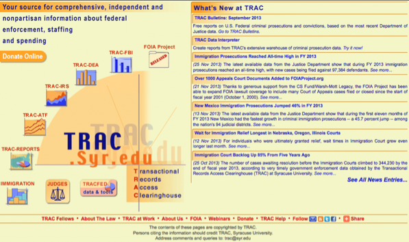
TRAC, or The Transactional Records Access Clearinghouse, is a huge amount of data on federal enforcement of criminal law, immigration & other matters. This is a great source of raw data to draw into your projects, apps, or reports. TRAC describes itself as “a data gathering, data research and data distribution organization at Syracuse University.” It also has some visualizations … Read More
Create Interactive Web-based Data Tables: tutorial from Data for Radicals
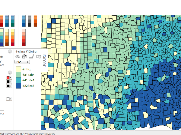
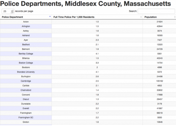
Data For Radicals has a great tutorial for making searchable, filterable tables of your data. Here is a clip of the illustrated, step-by-step tutorial, go over to the site for a full version. Visual approaches to data are great — they can allow us to grasp complex issues at a glance, just the way this map from Clear Health Costs … Read More
Make an interactive vertical timeline: tutorial from Data for Radicals
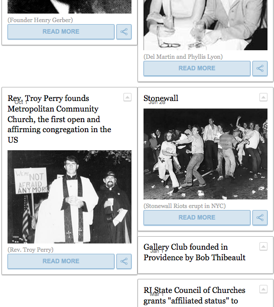
I found the wonderful Data for Radicals site, that has a rich set of illustrated tutorials on making interactive visualizations. Since I’ve been collecting timeline-creators, here’s another example — but this time, it’s a Vertical Timeline. A clip of the tutorial is below, go to this link to see the full thing! The Absurdly Illustrated Guide To Your First Dynamic, … Read More
How to create a Gantt Chart in Excel
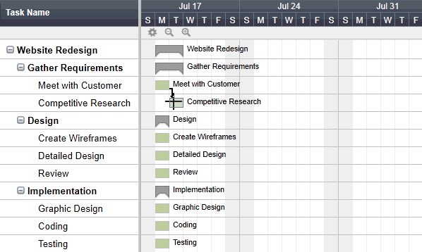
Use Gant Charts to create a project management system, or a way to see what needs to happen before you get a finished project. You can create cascading dependencies based on time, so that you see how time changes will affect other parts of the process & the final deliverable. Here is a tutorial from SmartSheet. What Is a Gantt … Read More
Make an Interactive Timeline: TimelineSetter
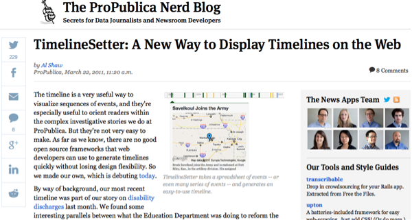
ProPublica has created an interactive timeline-maker TimelineSetter. You can create a spreadsheet with special formatting & layout, and then load it into the code that you’ve installed on your website. TimelineSetter 0.3.2 TimelineSetter creates beautiful timelines. It is a command-line utility that takes a specially-structured CSV file as input and outputs standards-compliant HTML/CSS/JavaScript. It supports any span of time from … Read More
Make Infographics in PowerPoint
5 Infographics to Teach You How to Easily Create Infographics in PowerPoint [+ TEMPLATES].
Create beautiful Venn Diagrams
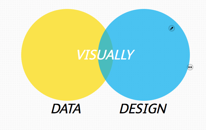
Visual.ly has a very easy tool for you to create venn diagrams, compose them beautifully, and download them. It’s a quick simple app to use to make a very clean visual.
Make Interactive Visuals with D3
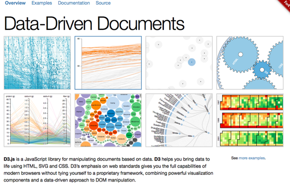
D3 is a way to make interactive visualizations from datasets, that you can display online, embedded in HTML. Make complex data usable, visible, and powerful! How to use D3 in your project? I you know how to use JavaScript, you’re off to a great start. For people who want to look through a bunch of tutorials and exercises, check out … Read More
