Design mechanics are sets of insights and tools that we can use what interventions we can design — and how to get people to use and engage with our ideas.
Within the wide of umbrella of mechanics we have specific categories to be deployed.
FOR IDEAS: What solutions should we focused on?
- Ideabook, concepts that I & others have thought of
- Problem book, what users want, what is going wrong with the status quo
- Analogy List, taking from other industries & situations and bringing their learnings into the world of law
- Inventory of other projects, what else has been tried & works
FOR ENGAGEMENT: How do we create designs that people want to (and will) use?
- Nudges, ways to trigger people to behave in certain ways
- Vehicles/forms, ways to deliver solutions, forms for interventions to take
- Levers, materials that designers can use for an intervention
- Heuristics, rules of thumb that will shape users’ perceptions & behavior
- User requirements, Personas, and Mental models
FOR IMPLEMENTATION: What are good designs, that are intuitive & usable?
- Principles and best practice standards
- Patterns: Design pattern library, templates, product typology
- Models: Interfaces with promises
Solution Patterns to draw from
I am gathering patterns for solutions, general structures that could possibly be remixed into a new legal services solution.


PATTERNS for designing legal websites:
For the Orientation, Entry-Points
Portal
Portal layouts can provide a high degree of customization for users. They’re ideal for news sites, but not a replacement for a well-designed Dashboard in a business application.
For the Information-Finding Function:
Master/Detail
The Master/Detail screen layout can be vertical, horizontal, or even nested. It is ideal for creating an efficient user experience by allowing the user to stay in the same screen while navigating between items. A horizontal layout is a good choice when the user needs to see more information in the master list than just a few identifiers, or when the master view is comprised of a set of items that each have additional details.
Column Browse
The Column Browse screen layout can be vertical or horizontal and a number of levels deep. Ideal for creating an custom user experience by allowing the user to start from various entry points for navigating hierarchal or related data.
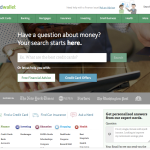
Search/Results
The Search screen pattern can range from very simple to quite advanced. This pattern is ideal for creating an efficient user experience by allowing the user to navigate directly to an item or set of items meeting specific criteria.
Refine Dataset
The Refine Dataset layout can be vertical or horizontal, and is ideal for creating an efficient user experience by allowing the user to refine a set of known data, or further refine search results.
Question/Answer
The Q/A screen layout is ideal for helping a user quickly find a solution. Q/A differs from Search/Results in that it can assist users in identifying possible options or a single recommendation in an arena they are lacking expert knowledge (e.g., health insurance, mortgages, or budgeting).
Tabbed
Tabs can be vertical or horizontal. The Tabbed layout should be explored after all other layouts have been considered. Before choosing the Tabbed layout, double check that this approach won’t make users tab between sections to complete a single workflow. Remember to apply the “one screen per goal” philosophy. A Tabbed layout can work well when there is workflow requiring data to be analyzed from multiple perspectives, as with a list, chart, and heat map.
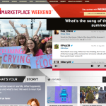
Browse
Browse can provide the best layout for users who goal is to quickly scan and navigate information. It can be two or three columns and typically the primary content is in the left most column, with additional related options served up in the right column(s).
Parallel Panels
Parallel Panels can be stacked (showing one at a time) or unstacked (showing all at once). This pattern is ideal for organizing chunks of information that are similar or have interdependent tendencies. Efficiency is gained by keeping the user in one screen. Ideal candidates for the stacked variation of this pattern are simple workflows with a visible goal that is fed by multiple inputs or multiple non-sequential steps.
For Dashboard & Management of Tasks, Personal Info:
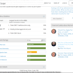
Dashboard
A Dashboard layout will provide key information at a glance, real time data, easy to read graphics, and clear entry points for exploration. Stephen Few’s book, Information Dashboard Design: The Effective Visual Communication of Data can be used for reference in designing and testing Dashboard designs.
For Process-Guidance, to get tasks done step-by-step
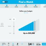
Wizard
The Wizard layout is ideal for guiding a user through a complex or infrequent workflow. It can be vertical or horizontal depending on the nature of the data.
For Doing a Task, Filling in information
Forms
Any Form layouts should be approached with a solid understanding of usability and design best practices. Web Form Design: Filling in the Blanks by Luke Wroblewski is a terrific resource for designing forms.
Spreadsheet
The Spreadsheet layout can offer easy edits, additions, previews and totaling. This type of screen should provide the following functionality: standard table features like sort, hide/show columns, rearrange columns, group by (if applicable), global level undo/redo, add/insert/delete row, keyboard navigation, import and export, and possibly preview and summary functionality.
Interactive Model
The Interactive Model layout is characterized by many interactive elements associated with a core object (e.g., a graph, calendar, map, sheet music, or text). It closely aligns with the user’s mental model and offers direct manipulation.