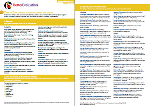
The excellent site Better Evaluation has an enormous collection of data visualization tools & advice.
It is a rich description of possible visual techniques to use to convey your data more effectively.

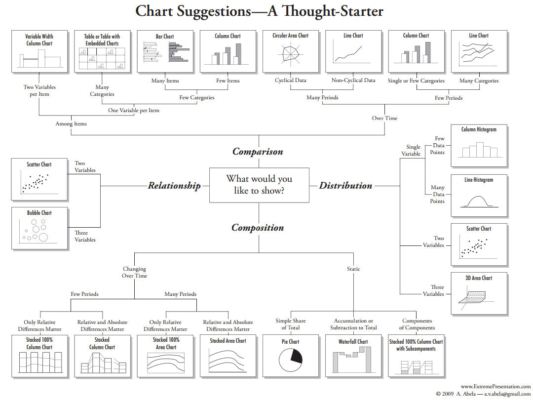
Data visualisation is the process of representing data graphically in order to identify trends and patterns that would otherwise be unclear or difficult to discern. Data visualisation serves two purposes: to bring clarity during analysis and to communicate. The choice of what type of graph or visualisation to use depends greatly on the nature of the variables you have, such as relational, comparative, time-based, etc. Here we have adopted and modified the categorization system used by ManyEyes. That said, sometimes graphing data with an inappropriate visualisation can lead to insights during analysis that would have remained hidden. Experimentation with visualisations during analysis is okay, but when communicating a visualisation, use the graph types listed under the proper options below. Incorrect visualisation leads to confusion, errors, and abandonment among viewers. The options listed here can support both purposes of analysis and communication. You may want to graph data during analysis to see, for example, spikes in website traffic related to your social media campaigns. Visualisation, in this instance, eases data analysis. When communicating that data, however, the visualisation may need to be simplified and key areas may need emphasis in order to call the attention of readers and stakeholders. See the discussion under Report and Support Use for more information about how you may want to repackage a data visualisation for communication purposes.
Options
See relationships among data points
Scatterplot
Displaying the relationship between two quantitative variables plotted along two axes. A series of dots represent the position of observations from the data set.
Matrix Chart
Summarising a multidimensional data set in a grid.
Network Diagram
Depicting how people or other elements are related to one another.Compare a set of values
Bar Chart
Illustrating the main features of the distribution of a data set in a clear way.
Block Histogram
Presenting a frequency distribution of quantitative data in a graphical way.
Bubble Chart
Providing a way to communicate complicated data sets quickly and easily.
Bullet graph
Using a target line to show progress to date, often with levels of performance graphed in the background.
Deviation bar graph
Aligning two bar graphs along their spine to compare the shape of their data sets.
Dot plot
Plotting two or more dots on a single line for each category being compared.
Small multiples
Positioning several small graphs with the same scale in a row for easy comparison.Changes over time
Line Graph
Displaying information as a series of data points connected by straight line segments, on two axes.
Slopegraph
Comparing change between two points in time with a line.
Split Axis Bar graph
Regraphing comparison between two points in time by simply graphing the change that has occurred in that time frame.
Stacked Graph
Visualising how a group of quantities changes over time. Items are “stacked” in this type of graph allowing the user to add up the underlying data points.See the parts of a whole
Icon array
Arranging a matrix of icons (usually 100 or 1000 icons) typically as a frequency-based representation, simultaneously displaying both the number of expected events and the number of expected non-events.
Pie Chart
Illustrating proportion through a circular chart divided into sectors (like slices of a pie).
Treemap
Making use of qualitative information in the form of important distinctions or differences that people see in the world around them. They help overcome some of the problems that may be encountered when dealing with qualitative information.Analyse a text
Phrase Net
Connecting key words in a text using lines to show linkages.
Word Cloud
Displaying the words in a qualitative dataset, organised by frequency of use.
Word Tree
Displaying of the words in qualitative dataset, where frequently used words are connected by branches to the other words that appear nearby in the data.See the world
Demographic Mapping
Using GIS (global information system) mapping technology to show data on population characteristics by region or geographic area.
Geotagging
Adding geographic information about digital content, within “metadata” tags – including latitude and longitude coordinates, place names and/or other positional data.
GIS Mapping
Creating very precise maps representing geographic coordinates that could include information relating to changes in geographical, social or agricultural indicators.
Interactive mapping
Using maps that allow zooming in and out, panning around, identifying specific features, querying underlying data such as by topic or a specific indicator (e.g., socioeconomic status), generating reports and other means of using or visualising select information in the map.