Last Friday at Stanford d.school, I hosted an informal meetup among those interested in how to visualize law, and make legally-informative visuals. It wasn’t so much a design sprint or hackathon (aimed at getting as much work done to a final product in a short time), rather than an experiment in sharing recommendations, talking about how we’ve used and made visuals, and what some good lessons, practices & tools are.
We had a mix of lawyers, law students, designers, and a journalist as well. After going through some essential principles of visual design, we did a run through of some of the software tools that we find most useful. I am making a running list of these over at the new sub-site Legal Design Toolbox — a collection of resources for designing visuals, products, and organizations in the legal world.
The event format was an experiment for me as well. Rather than my usual design workshop — with a planned structure, lots of strict time cut-offs, and expectations of deliverables — this was a free-form working session.

I had hoped people would come with their own problems & challenges we could tackle together — but instead people came with an interest in what design is & how it might be useful to their work. Some already have been making visuals — data visualizations and cartoons — and many have used maps in their legal work & studies.
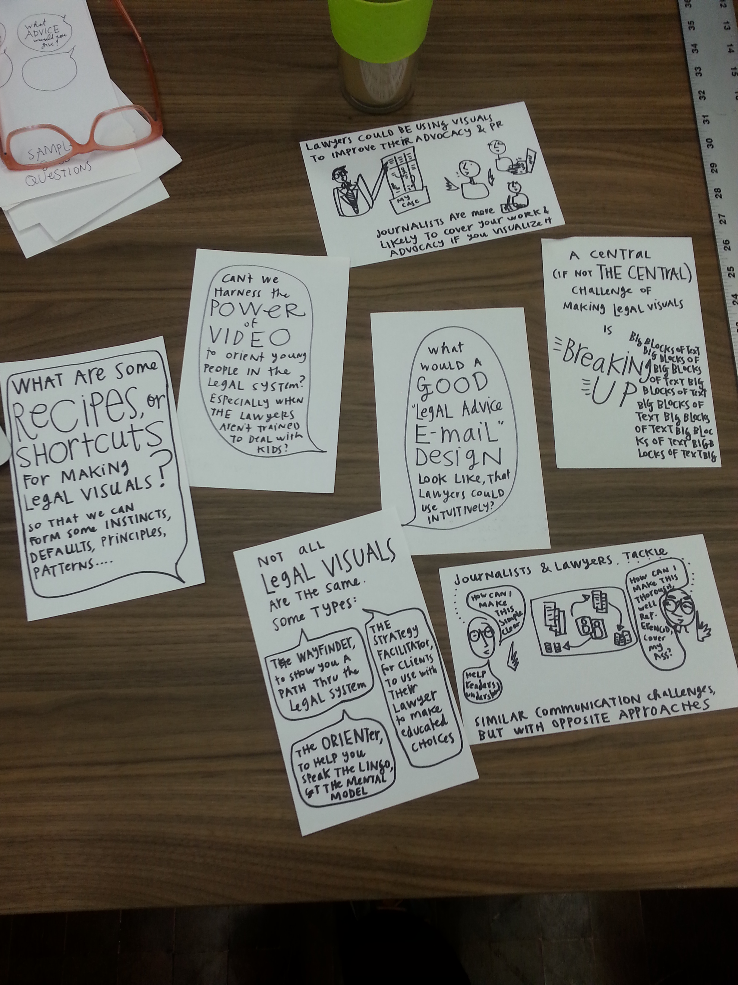
The event was good for conversation. I had set up boards around the room for sharing on certain topics — principles, patterns, software tools, and process to follow. It was good for a collective brain-dump, that was then documented and shareable.


Then, because no one had brought problems of their own, I supplied law to be visualized — from a manual on immigration pathways for unaccompanied minors in the US. Everyone got to take a chunk of the manual, and then select something small — a clause, a list, a paragraph, even just a sentence — to visualize. As we worked through our section, we talked about what kinds of visuals work for what kinds of materials. And we talked through some of the essential challenges:
- how to break up big chunks of text,
- how to be responsible to clients who might take visuals very literally,
- how to still use full-on legal jargon words, but balancing them with composition & symbols to make them more comprehensible
After the event, I came up with some observations & notes from the conversations which I drew up & have over at Open Law Lab. I’ll be looking forward to future Visual Law working sessions — whether it’s conversational meetups like this one, or some design sprints to tackle some of the challenges we’ve identified. Some of the topics for events that seem to be in demand are as follows:
- how to use Adobe Illustrator to make clean & scalable graphics
- what are good design principles & templates for lawyers to use when emailing clients legal advice
- what is a good template or set of design patterns for visualizing a legal brief — potentially a claim map or table
- how to build an interactive flow chart to document a legal process, or to determine eligibility for a legal remedy
- working together to create a set of open source, reusable legal icons and symbols to be used universally, and create a common legal visual language


1 Comment
Hi Margaret,
I have puzzled with similar design questions for a long time and ended up crafting a design system titled “Visual Language for Lawyers”. The book & training materials have been published in Dutch. A summary and some articles are available in English. I also have done some design & consulting work for actual visual contracting projects.
I am looking for someone to run with the translation project and possibly with the business concept as well, as I am focusing on other creative projects.
Feel free to contact me if you know someone for whom this would be a good opportunity.
Thanks, Susanne