I’m doing user research on how non-lawyers use the Internet to find legal help. Almost every user chooses Google Search as their Port of Entry into the world of online legal help. But as a Port of Entry, Google search results are not user-friendly — or not as user-friendly as they could be.
I propose that Google redesign the Search Results pages it displays to users who are searching for help for personal legal problems. Through some simple interface redesigns, Google could guide the user to reliable, supportive, non-commercial resources that exist online — but that right now are buried in a confusing jumble of search results.
Redesign Proposal: Priority Boxes in search results
One easy Google Search redesign: when a user searches for legal help, the search results page could display a “Priority-Box” highlighting public, trustworthy legal resources to the user. Instead of ads for commercial services or a grab-bag of website listings, Google could direct the user to official government sites, court-provided documents, legal aid group contacts, and other resources that are provided by public organizations which have trustworthy information & are not trying to profit off of the user’s legal problem.
So, if a user searches for ‘How to Apply for a Green Card’, her search results would begin with a Priority-Box (that precedes the ads & search results list). The Priority-Box would direct the user to the USCIS site & provide a brief summary of what to expect there, and why it is trustworthy.
Or for the user who searches ‘How to file for Divorce in California’, her results page would display a Priority-Box with a short paragraph explaining that she can use the California Courts’ Online Self-Help Center, which provides free, public guides and forms to understand her situation & take action.
Google Search already provides these kinds of ‘Priority-Box’ results for some searches — like those for flight paths, weight conversions, or word definitions.
Couldn’t Google use the same type of ‘Priority-Box’ to point searchers to reliable, public legal help?
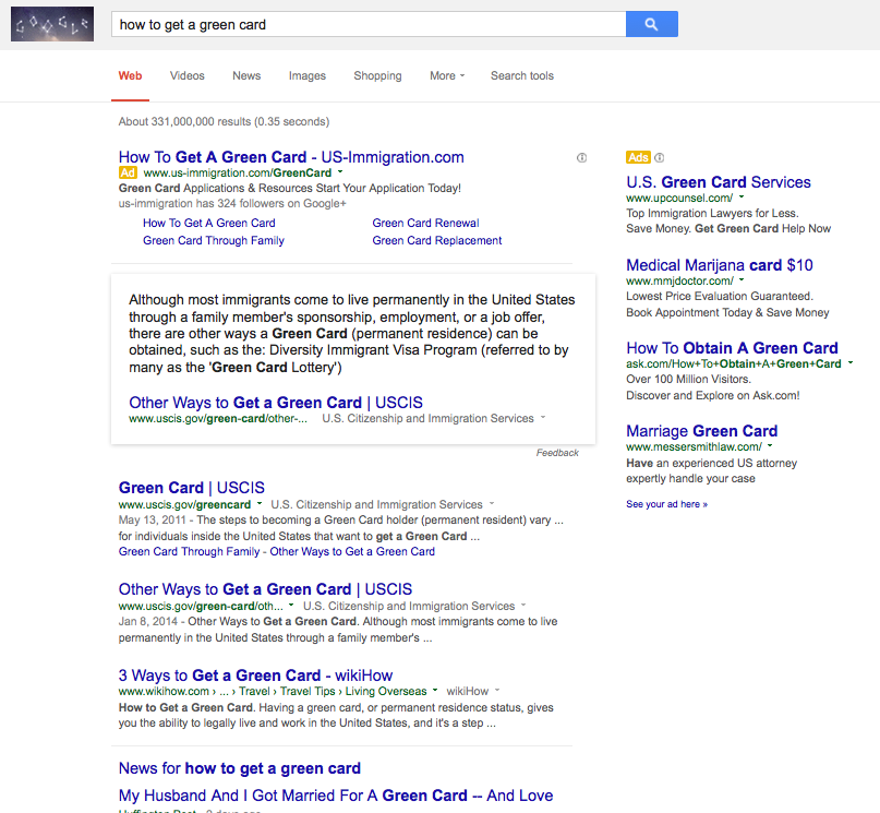
I did a whole lot of legal help Google searches to see if I could trigger any such Priority-Box result. I only found one: on how to get a Green Card. As the screenshot below shows, on this result, Google still features an ad from a commercial immigration provider as the first result. But underneath it, there is a Priority-Box clip of information from a government site. It gives a short, reliable answer to the question that the search posed. And it directs the user to the government site for more information.
Clearly someone at Google Search is already toying with the idea of giving special priority to government-sponsored answers for legal help queries. I’d love to see this policy expanded, in a number of directions:
- More Priority-Box treatments: there should be similar boxed-off, highlighted interfaces for common legal help queries, like eviction, divorce, and bankruptcy
- Short orientation text: even if there is no clear ‘answer’ to the user’s search question, the Priority-Box can feature a small description of what information she should know to understand the options open to her & what context is relevant. This kind of orientation text is used in the ‘how to get a green card’ Priority-Box in the search results above. This text can help the user as she looks through the ads and results list, to be more strategic about where to click & who to trust.
- Localized results: if the user is searching from San Francisco, California, then direction to local courts’ & aid groups’ resources — with the option to customize the location
- Links to official forms: if the query relates to a problem in which official forms & documents are relevant, then direct the user to the documents provided on government agency or courts’ sites, rather than those hosted on commercial, pay-for-use sites
What’s wrong with Google’s Status Quo
Why is a redesign of legal search results so necessary? Because the current status quo is so confusing & possibly harmful to legal consumers.
If you do some quick Google Searches on consumer-law types of legal queries — on help with eviction, estate planning, divorce, visas, or bankruptcy — the search engine provides the Google list of results that we’re all so accustomed to:
- a count of results, numbering in the many millions, if not billions
- several results marked as ads in the main list
- a sidebar of results marked as ads
- underneath the 3 or 4 main-list ads, a list of about 10 website headings & short descriptions
A savvy user can browse through the results, maybe even clicking past the first page to the 2nd and 3rd pages of results. They can check for the website’s reliability by looking for markers, like a web address that ends in ‘.gov’ or an apparent affiliation with the Courts or Government Agency that likely is responsible for the legal process in question.
But the site itself gives no direction or support to the user — other than what they put first & most prominently on the page. With Google, its always ads that are put in the priority position, at the top of the list, right under the search bar. These paid-for results are consistently from commercial entities, whether they’re law firms or legal service websites like LegalZoom or Rocket Lawyer.
After the ads, the first ‘genuine’ website recommendations often are something from a .gov site — which we can expect to be a relatively good outcome for the user. But mixed into the top 10 results are a mix of other types of resources —
- from commercial legal self-help sites, primarily Nolo.com
- from news outlets like CNN or Huffington Post
- from celebrities like Oprah
- from generic ‘help’ sites like About.com, Wikihow.com, or Yahoo Answers
Here’s a sample of Google Search query results, from my computer (which Google clearly knows is being used in the Bay Area, and perhaps knows has been used for lots of other legal queries & browsing).
None of these Search Results pages are by-definition bad for our user, but they are not ideal. The user has asked a question, and Google Search responds with a crowded & directionless menu of possible options.
That’s why a Priority-Box approach has such promise: to give some initial orientation & direction to the user. The search result page could answer the question in a clear, commanding way — and with information that is coming straight from a reliable source (the government or the courts) that is not being provided with a profit-motive.
If you look at consumer complaint websites about legal service sites, it’s clear that many legal users end up on commercial legal services sites to get their problems solved — and do not realize that there are free, public resources that they could have used instead. For example, peruse the Consumer Reviews’ complaint board for Immigration Direct, a for-profit legal service site that provides users with immigration forms for a fee.
These complaints show how easy it is for users starting from Google Search to end up on a legal services site that seems official, but is not, and that seems to have their best interests in mind, but does not. Many users cannot navigate the current Google Search results page in a way that’s strategic or smart.
Some simple interface design tweaks — with a priority on giving direction to trustworthy, public resources — would be an inexpensive first step in protecting & empowering legal users online.


1 Comment
[…] is exciting in itself — but it also could be a great model for legal knowledge searches. I wrote earlier about the potential for Google to be a more usable legal help portal. This model, with trustworthy & clear information surfaced in response to a common query, would […]