via Why Most People’s Charts & Graphs Look Like Crap on HubSpot’s Inbound Hub
by Ross Crooks
May 28, 2014
Data visualization is a powerful tool to communicate complex information in an engaging way. By visualizing information, our brains can synthesize and retain content more effectively, increasing its impact. But if data isn’t properly visualized, it can do more damage than good. The wrong presentation can diminish the data’s message or, worse, misrepresent it entirely.That’s why good data visualization relies on good design. And it’s about more than just choosing the right chart type. It’s about presenting information in a way that is easy to understand and intuitive to navigate, making the viewer do as little legwork as possible. Of course, not all designers are data visualization experts, which is why much of the visual content we see is, well, less than stellar. Here are 10 data visualization mistakes you’re probably making and the quick fixes to remedy them.
1) Misordering Pie Segments
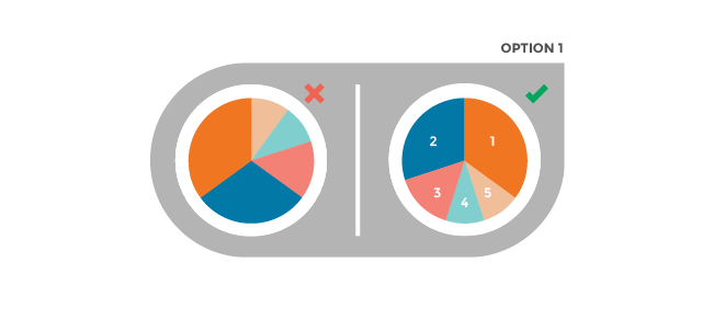
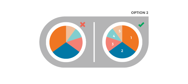
Pie charts are some of the most simple visualizations, but they are often over-complicated. Segments should be ordered intuitively (and they shouldn’t include more than five segments). Here are two ways to order your pie charts, both of which will draw the reader’s attention to the most important information.
Option 1: Place the largest section at 12 o’clock, going clockwise. Place the second largest section at 12 o’clock, going counterclockwise. The remaining sections can be placed below, continuing counterclockwise.

Option 2: Start the largest section at 12 o’clock, going clockwise. Place remaining sections in descending order, going clockwise.
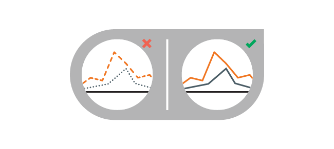
2) Using Non-Solid Lines in a Line Chart
Dashed and dotted lines can be distracting. Instead, use a solid line and colors that are easy to distinguish from each other.
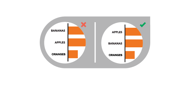
3) Arranging Data Non-Intuitively
Your content should be presented in a logical and intuitive way to guide readers through the data. Order categories alphabetically, sequentially, or by value.
4) Obscuring Your Data
Make sure no data is lost or obstructed by design. For example, use transparency in a standard area chart to make sure the viewer can see all data.

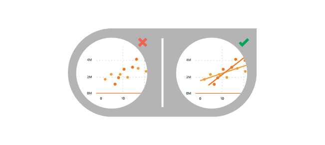
5) Making the Reader Do More Work
Make it as easy as possible to understand data by aiding the reader with graphic elements. For example, add a trendline to a scatterplot to highlight trends.
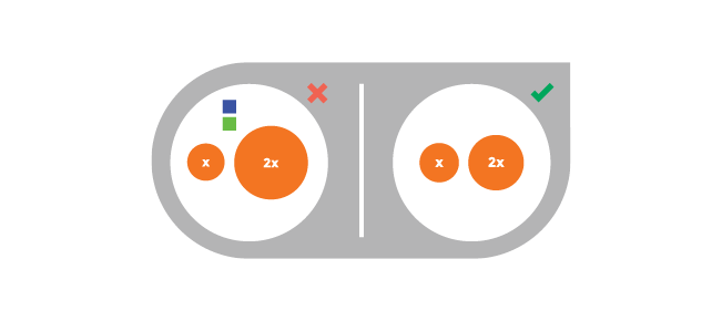
6) Misrepresenting Data
Makes sure all representations are accurate. For example, bubbles should be scaled according to area, not diameter.
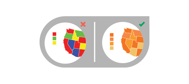
7) Using Different Colors on a Heat Map
Some colors stand out more than others, giving unnecessary weight to that data. Instead, use a single color with varying shades or a spectrum between two analogous colors to show intensity.
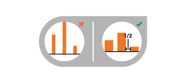
8) Making Bars Too Wide or Too Thin
It’s tempting to get creative with your presentation, but keeping things consistent helps your viewer. The space between bars in a bar chart should be ½ bar width.
9) Making it Hard to Compare Data
Comparison is a valuable way to showcase differences, but it’s useless if your viewer can’t easily compare. Make sure all data is presented in a way that allows the reader to compare data side-by-side.

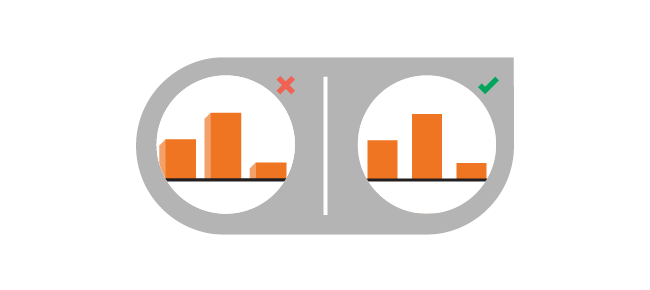
10) Using 3D Charts
Though they may look exciting, 3D shapes can distort perception and therefore skew data. Stick with 2D shapes to ensure data is presented accurately.
