This Field Guide is written by our Class Team, Guillermo Aldunate, Margaret Hagan, Jorge Gabriel Jimenez, Janet Martinez, and Jane Wong
Over the past quarter, the Stanford Legal Design Lab has established a regular on-site civic user testing group at the California courts. Through a policy lab class, Community-Led System Design Practice, our team of five students, teachers, and fellows has developed a user testing protocol for people working on justice innovation. It is particularly aimed at court staff and executives, legal aid leaders, and others who are interested in making the justice system work better for people — and who are considering where to spend resources on innovation.
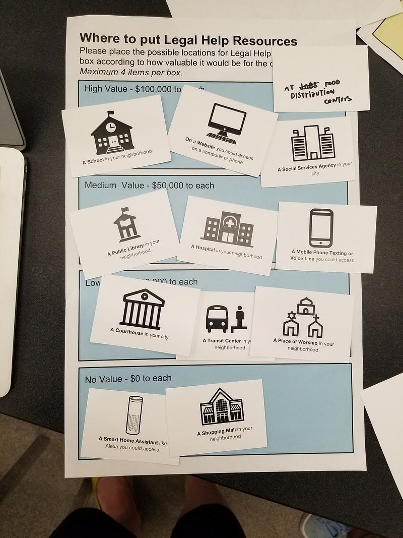
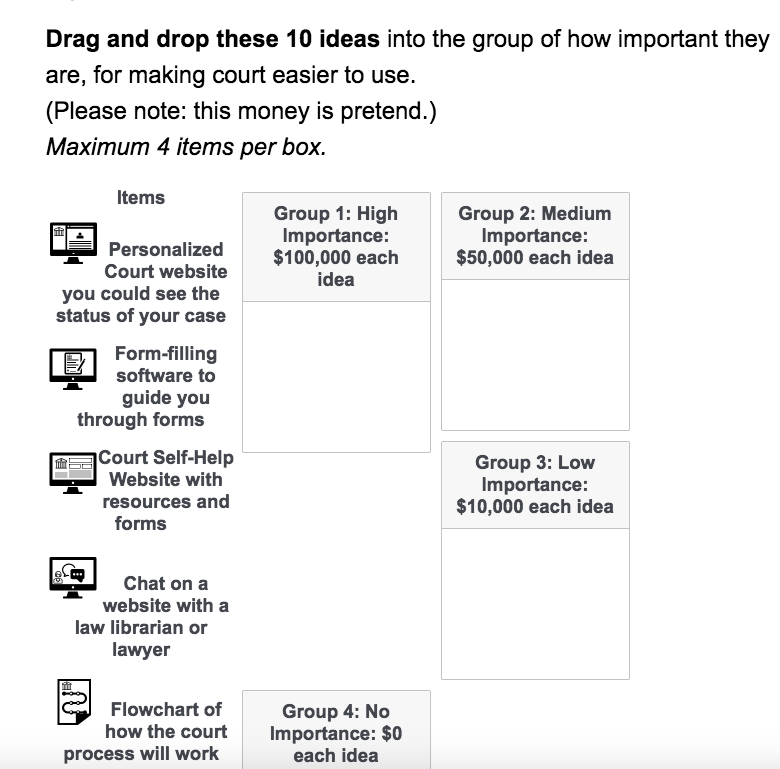
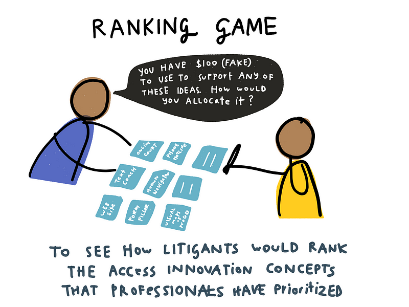
We ran weekly court user testing sessions in May and June 2018, speaking to a total of 55 court-users, with approximately 9 users each visit. On average, we spoke with them for 20 minutes, structured around two short surveys. Our surveys, run on Qualtrics or on paper cards/canvases, asked court visitors to rank different ideas for ‘innovations’ in for civil justice self help, and then to rank different places where self-help resources may be located. These surveys were meant to draw out the explicit rankings of different innovation efforts from the users’ point of view, as well as to understand their driving values and preferences.
We spoke with an approximately equal number of men and women. Our participants were a mix of self-identified Hispanic/Latino background, white background, and African American background, mainly from San Jose, California. They all had proficiency in English, though some spoke Spanish as their first language at home. They ranged from low to high confidence in technology. We had participants from 18 years old to 85 years old. Most had visited the court more than three times, mainly for housing, family, probate, or debt issues.
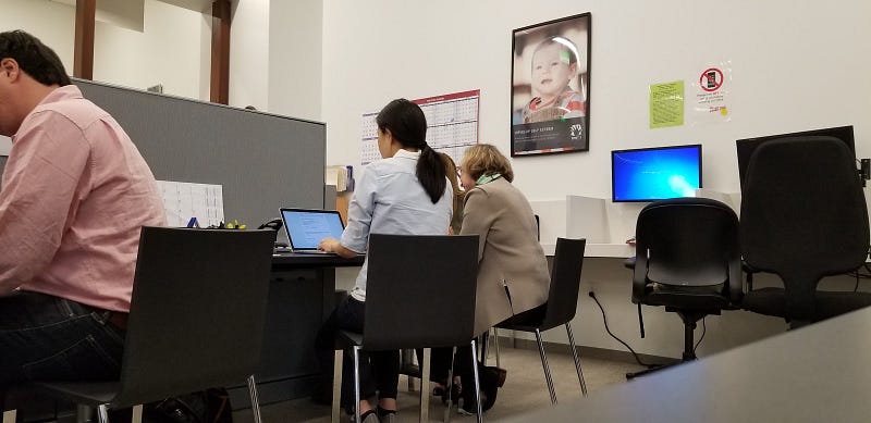
We were hosted by Santa Clara County Self Help Center. They let us run the testing in their center, and made announcements to litigants and visitors waiting in line about our tests. This helped us attract participants, and made it convenient to speak with them while they were waiting in line. We were able to compensate them with funds from our d.school class, Community Led System Design, which had given us an Equity and Engagement grant to run user testing.
The Logistics of Testing in Court
We experimented with various modes of running testing, to determine which got the highest levels of engagement and follow-through with Self Help Center users.
- Length of the interview: One of the most important logistical aspects of the interviews is its length. The users of the interview are waiting to be assisted by the self-help center when the interview takes place. The users tend to go when they are called to be assisted so it is important that the length of the interview does not exceed 20 minutes.
- Days of the week: The interviews were conducted during different days of the week: Monday, Tuesday and Thursday. If we ranked the days in which we were more successful the ranking would be this: (i) Thursday; (ii) Tuesday; (iii) Monday. Thursdays were when the Center was most crowded during the past two months — and people tended to sign up to speak with us at a quicker rate. We don’t know exactly why this is — though we know that after a long weekend (like Memorial Day), the day back was especially slow.
- Roles: During each interview, at least two researchers ran the session with a single participant. One person asked the questions and the other one was in charge of taking notes to capture the qualitative answers. (The rankings themselves were tracked by Qualtrics, or we took photos of the card placement on our canvases). These qualitative answers are as important as the quantitative responses.
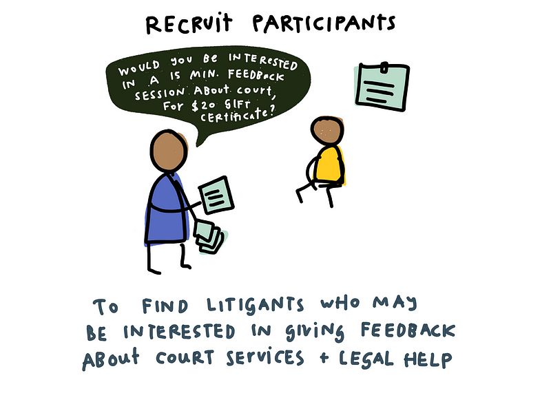
- Recruitment: The court staff had agreed to help us recruit participants from the Self Help Center. They made morning announcements to tell people waiting that we were present, that we were interested in hearing people’s feedback, and that we would be taking sign-ups. A rotating member of our research team was responsible for the sign-up sheet at the entrance outside the office. We would give them the information sheet about the research, explain what was expected, and then sign up interested people to get a time slot to speak with us while they were waiting.
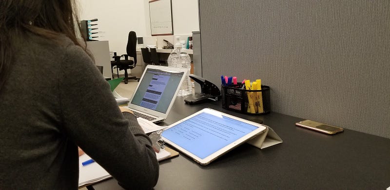
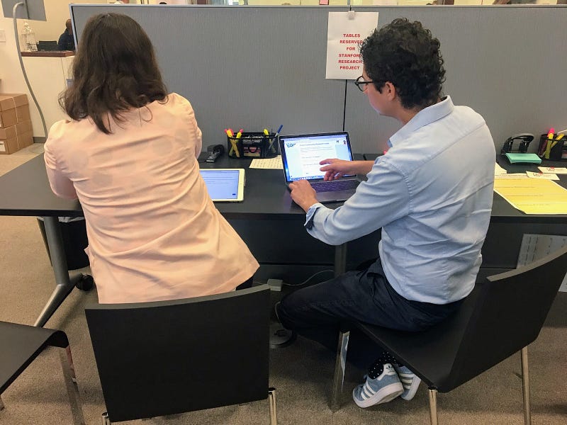
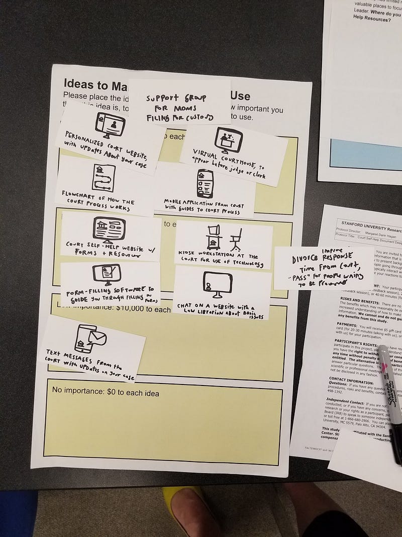
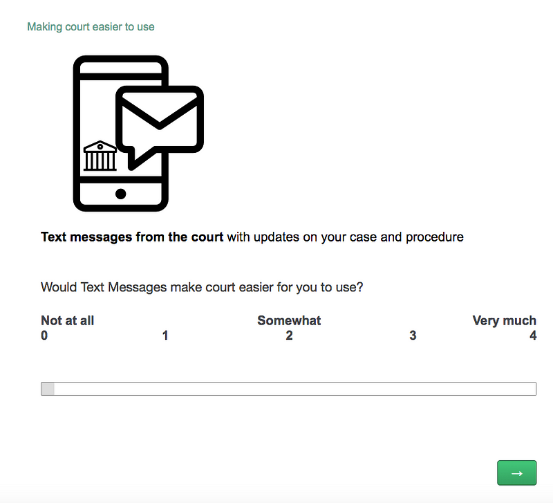
- Paper vs. Tablet: We made two versions of our survey — one on an iPad with a Qualtrics survey, and one on a large paper canvas with index cards of ideas. In both modes, the participant would sort and rank ideas for innovation. The test worked well with both instruments. However, the users have a tendency to reorganize their preferences more in the Tablet rather than in paper. Doing the interview with paper is usually faster — which can be advantageous, but we found that the thought process might be richer on the tablet. We can also gather more ranking information, and with more consistency on the Tablet, so we shifted to all-Tablet testing (except for when a participant expressed an interest in paper instead). The paper option is also a good back-up if unexpected logistical problems around internet, charging, or a surge of participant interest arose.
- Compensation: The user received a $20 Amazon gift card after the interview. We had more survey respondents because of this compensation. The university was able to provide this compensation. We know this might be an issue for courts, to get funding to provide funding support. Partnership with a university lab can be a way to do this.
- Qualitative answers: Most of the answers of the survey were quantitative questions, with rankings of ideas along a Likert scale. The users tend to answer them very fast. It is very important to ask them why or what values make them take certain decisions. One of the 2 people interviewing a participant would be responsible for asking follow-up questions, like ‘Why did you choose that?’ or ‘What’s going through your head right now?’ This helps us to understand the dynamics behind the quantitative response, and to ensure we are not making assumptions about the rationales.
- New ideas: The users had very good ideas with open questions like, what should the Court stop doing? We might add more of these open questions, mixed alongside the rankings questions. The ranking questions helped us to establish trust and ease-of-participation with the users. We were not asking them too difficult or too personal questions. By the end of the first survey, they were more willing to speak at greater length about their ideas and priorities — so we would integrate more open-ended suggestion questions then.
- Concerns / limits around Language: Some of the users did not understand English as well as Spanish or other languages. A key aspect of the survey is to identify if a person is comfortable about doing the interview in English. We were fortunate to have 2 native Spanish speakers on our research team, who could conduct some interviews in Spanish if needed. In the future, we will have to invest in more language abilities in our team to be able to conduct demographically-diverse testing sessions, to ensure our findings are not biased towards English-proficient participants.
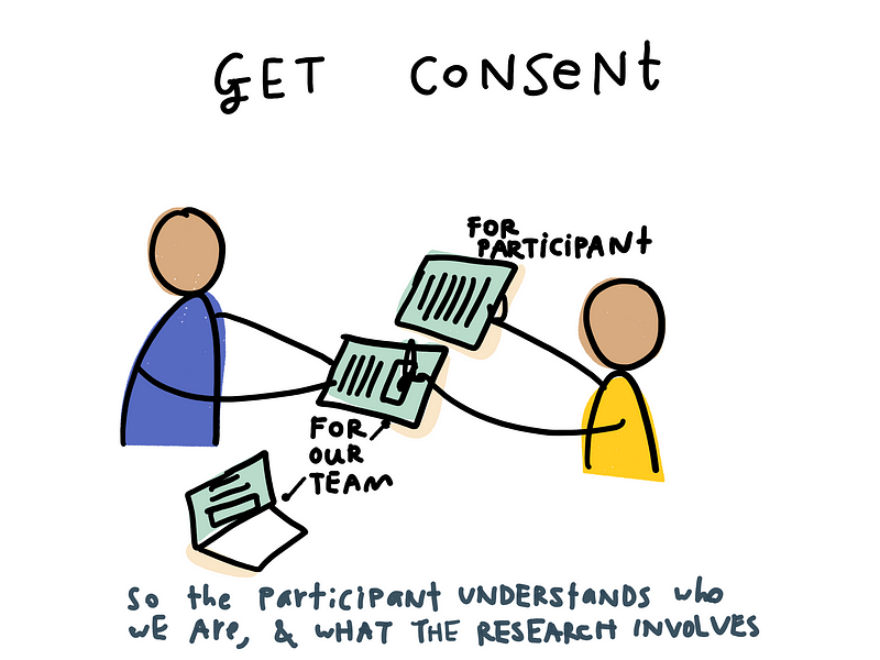
- Ethics: Consent form: It is highly important to inform the users of the key issues of the Consent Form like the risks, payment, and voluntary participation. We created a standard English-language consent form in an online form (that helped us to keep standard information in a more consistent way) but also with a paper print-out that each participant could take home with them.
What did we learn about Access to Justice innovation?
Rankings of ideas + locations for legal help innovation
What we have learned so far about an Agenda for innovation?
Regarding how to improve the user experience in court, most people chose chat on a website with a law librarian or lawyer as their preferred innovation, which courts should be investing in. In second place, interviewees chose virtual courts — in which they could appear remotely through a videoconference. The least voted ideas were the kiosk and the flowchart that would be a paper representation of the process they’d go through.
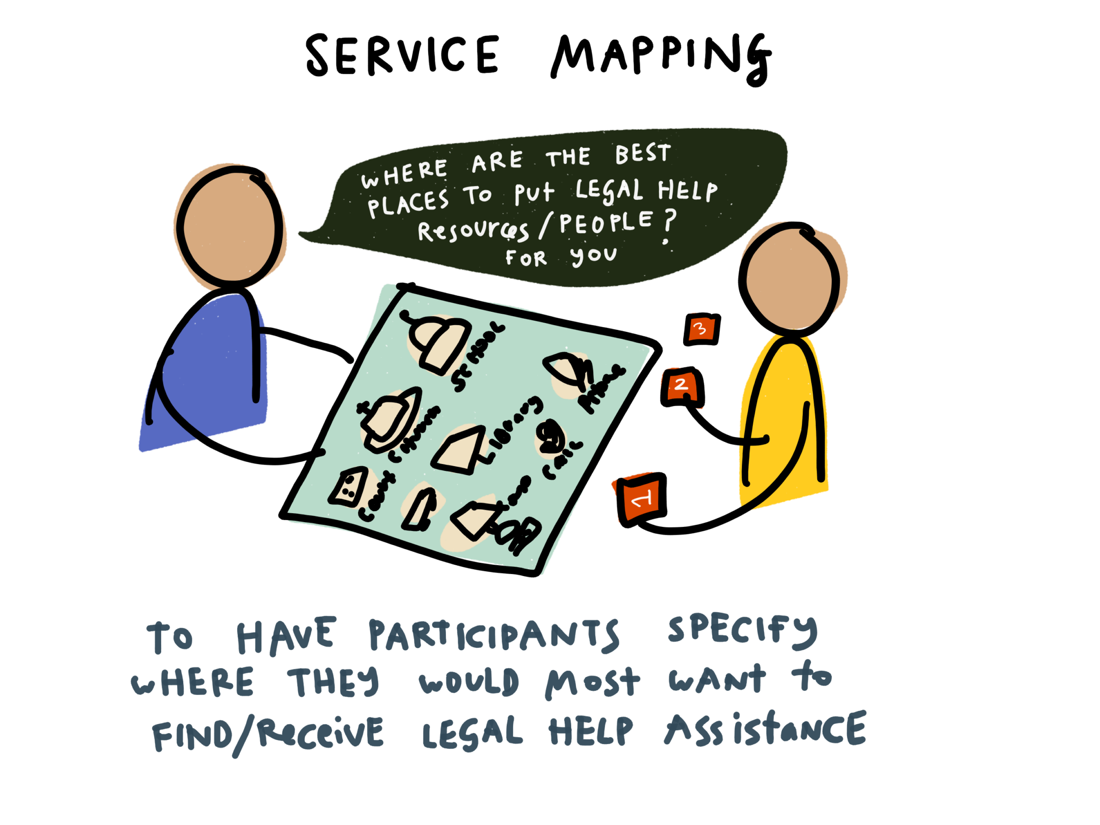
When talking about where to put legal help, people chose public libraries in first place, courthouses in second, and websites and phone texting were tied in third.
Some of the main takeaways from the interviews, around how we could improve user experience of court are as follows:
(i) people like and seek “personalized” attention. Their main preferences revolve around the idea of tailored attention;
(ii) confidentiality and data storage are two of the main concerns when talking about these “personalized” solutions. People showed concerns regarding the level of protection and possible breaches of their websites;
(iii) impersonal solutions were the least valued. Showing general information in an organized way, e.g. flowcharts, although useful, does not address adequately people concerns about their cases;
(iv) overflowing of text messages and smaller data-plan packages with your phone carrier can go against the text message option — which tempered people’s excitement for messaging as an innovation.
(v) if it is not possible to personalize the system, improving understanding of how the self-help center works and how their processes go forward seems critical. Improving the self-help center website and the development of a form-filling software are the second best options.
In the case of possible places to install legal help, identifying the main purposes of the different venues is critical. For example, most people chose public libraries because they “are places you go to get general information”. The same happens with courthouse. On the other hand, most people identified the mall with shopping with family, not for getting legal help. The same happened with places of worship. Demographics can be the key in choosing final locations, since they show preferences. Scaling up the survey and diversifying the base of interviewees may produce different results in this regard — if people have different mental models about where they seek help for problems.
Other proposals for help and locations
One participant recommended investment in ideas that provide more emotional support and peer advice, like a support group of mothers who have been through custody or divorce issues. It could be people who have already been through the process, and now are willing to advise litigants who have just begun. This was to address how scary and emotional the process is.
Many people identified “lack of staff” as their main critique system and so, they would allocate money to hire more self-help center personnel. This was a near-universal call from participants: hire more humans to reduce waiting, improve services, and create a more supportive and efficient experience
In terms of other locations for help to be located, participants had a number of ideas.
Community Events. A number of participants recommended that legal help resources be put in farmers’ markets, community parks, Starbucks, DMV, amusement park, senior center, volunteer desk at court, or at a jail. At these locations, they would be receptive to getting information from a government agency, or finding more resources about legal issues and help.
Food and Social Centers. Several participants mentioned that legal help resources could be co-located at food distribution centers, where people already go on a regular basis. They would be receptive to learning about more and other types of services there.
What were the underlying values & concerns of people?
Technology is valued if it promotes virtual services (not having to come to court).
Participants ranked virtual courthouse technology (like video-conferencing with a judge or a clerk) and mobile phone chat and guides highly, with the reasoning that it could save them a trip to court. There was a high priority on technology tools that would let a person get their question answered, or a dispute resolved, without the inconveniences of coming to court. Technology that provided reminders or procedural updates was valued, but not as highly. For example, one participant said, “Text Messages are important but not that important,” as compared to technology that is in front of you that would help you not to come here.
Some of the main concerns with coming to court are dealing with taking time off work; getting childcare for kids; paying for parking; dealing with traffic; and having to wait in a lengthy and uncomfortable way for services.
Importance of Face-to-Face feel (if not actual face-to-face)
Participants uniformly recommended that technologies that promoted the sense that they were having a face-to-face meeting or a back-and-forth conversation would be the most valuable. This would give them the sense that the service would be giving them personalized guidance, and offering information that would be relevant on choice of forms, steps to follow, and other key choices. It would also help relieve the stressful “feeling of being a tiny ant in a giant institution” as one participant said.
Though many people did not rank Alexa (or a similar smart home assistant) very highly, several participants did think that there could be something good to have a conversation that would help them make sense of the procedure for their own situation.
The boundary of value for this type of service was if it felt like they were being given automated responses, or slow services. They did not want to chat or go back-and-forth with a technology if it would just give general information — that would be incredibly frustrating, because they would be expecting something customized.
Tempered Excitement for Text Messages
Generally, the prospect of text reminders from court was welcomed. People would appreciate knowing where they are in the process. But there is apprehension about two-way text messages. If there was a chance or requirement of writing back over text messages, there would be a concern that a person would make mistakes. This is in addition to concerns about too many texts flooding their phones, or the charges that might accrue.
Personable technology for Urgency Triage
A main value of a more personable technology is that it might also give people a way to access more immediate help in urgent situations. There was the thought that right now services are fairly undifferentiated: everyone must stand in line, or wait on the phone, or wait for a return email without a sense of triage for urgency. A technology like a chat, or other face-to-face service, could help spot when someone needed emergency help, and then divert them to a fast-track of service.
Prioritization on better information and services
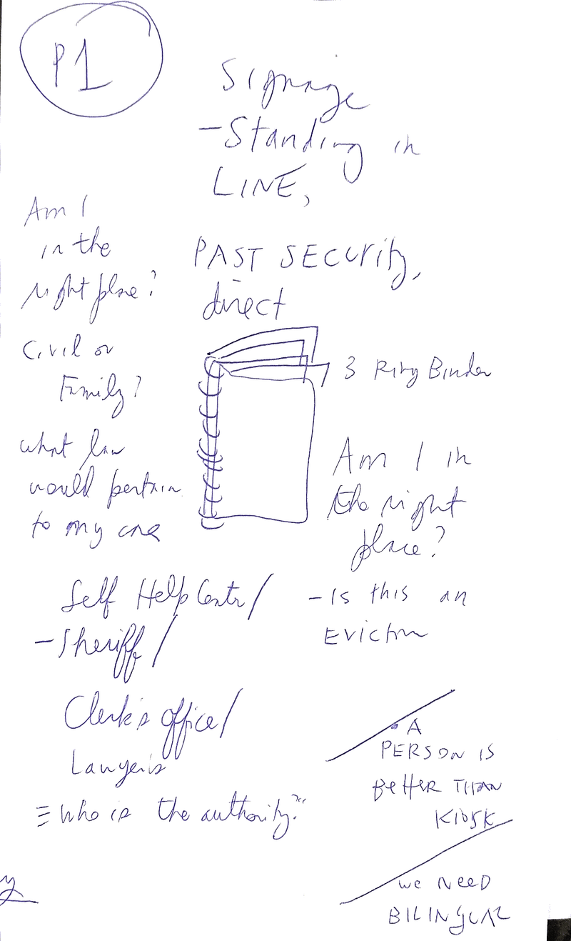
Users identified a number of values and functions desired, including both information and services. In the information category, a need for better communication of legal process: to quickly learn rights under the law, where help is located (online or physical), what the time will be to get help (4–6 weeks for some of our participants), and more. People want clear information on procedure, cost, and what the law says. Information needs updated more consistently.
Visual information is more important for older folks; online (kiosk) information better for younger. Personalized website and form-filling software have been helpful, so technology is helpful if helps people understand process and figure out their way through process, without having to come to court (and avoid time in transit and away from work.) Better information is needed on how different processes fit together, like that between family law and CPS.
In the service category, ability to “chat” with someone is highly valued. It can be with a virtual judge or a volunteer, even. A kiosk doesn’t necessarily give the experience of a “chat.” Many court staff are seen to be grouchy, like the DMV.
The Internet as a key location for legal help
The majority of the participants put a high value on Internet-based resources. They emphasized that whether it is on a desktop computer, mobile phone, smart assistant, or otherwise, the Internet is an extremely key source of information. The participants recommended much more investment in the level and interactivity of the information that is available online.
Keeping legal help separate from other areas of life.
One theme that emerged during the Location Ranking survey was that there were certain areas of life that legal help would fit, and others in which it would be inappropriate. These boundaries shifted somewhat by the person. Almost universally, shopping malls were considered inappropriate places, often because people were there to relax, or because there are mostly commercial, advertising-oriented organizations there. Though some found value in shopping malls, most people categorized this as a different ‘zone’ of life than their legal one.
For others, schools and churches were inappropriate for legal help, often because families and children were present — and they wanted to reserve those spaces and shield children from conversations and interactions around legal help. That said, many participants who had children did say that they would value if school had some legal information — like basics of the law, rights materials, and referrals to services — even if there were not full legal services provided there. This was based on convenience.

Into the Future
We are continuing our user testing, though moving to explicitly test new wayfinding, navigation, and language innovations in the court. This will be to lay the groundwork for our Design for Justice: Language Access class in Autumn 2018 at Stanford. We will use this methodology to know which 4 prototypes to focus our class testing on. We found this protocol to be extremely useful in vetting early-stage ideas, and to prioritize the values and personas that can guide our development work.
We will also be working on our coming-soon site Justice Innovation by Design, that will have more of these methods, templates, and models available for download. Our goal is to make an easily-replicable plan for more courts to run their own user testing sessions on a weekly basis — to test new forms, software, ideas, and ideas. It is relatively inexpensive and convenient to run court user testing sessions, and it has enormous benefit in getting community input and leadership in the access to justice movement.
Finally, for a more academic audience, we will also be writing up the findings of our survey work to provide a full report of what the community-driven agenda for access to justice innovation is shaping up to be. Stay tuned!
