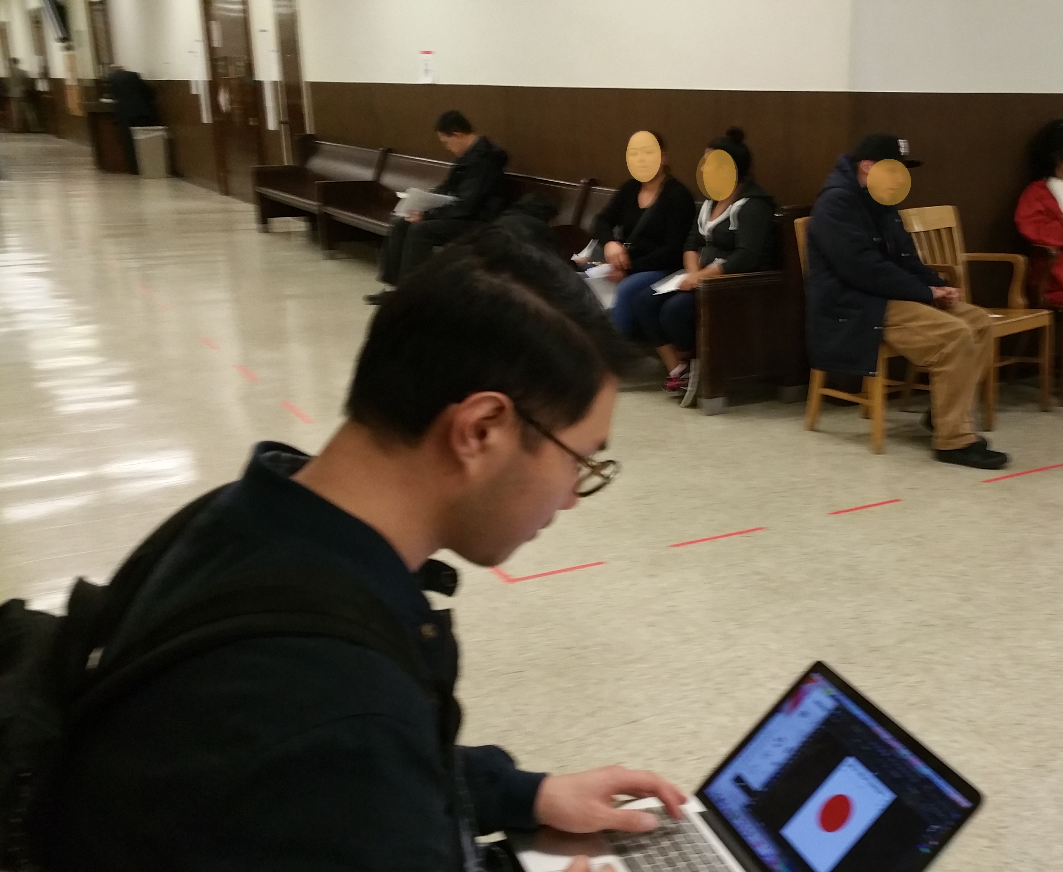
Today we held our Prototyping Access to Justice class on-site at San Mateo County court house, specifically in and around the Self-Help Center and Family Law Facilitator.
The six student teams are all at the point where they have working prototypes that they want to test. They each have hypotheses about how they can make the legal system better for people without lawyers, and have embodied these hypotheses into a new tool — digital- or paper-based.
Instead of our usual class setting at a design studio at Stanford’s d.school, we created an impromptu class space in the Waiting Area on the 2nd floor of the Superior Court, where people are lining up to see people at the Self- Help Center, or are waiting to be called for an appointment. Some of the teams also set up testing spaces inside the Self Help Center, for when people had down-time after they had filled in forms or were waiting for next-steps.
The teams sought out people to give quick feedback, as well as longer experiential testing. They had interactive click-through prototypes of digital tools, paper mockups of new tools, posters and floor pathways for navigation, and tablets with new feedback forms. They had gift cards to give to user testers, to compensate for their time.
They tested their prototypes in small groups — with some taking notes (or translating into Spanish) and others leading the questions. They also had designer and developer coaches with them, to help them spot new opportunities and to run the testings.
Takewaways
So what were the takeaways? I was able to pull out some high-level insights during my debriefs with each team, as well as some specific points for improvement.
1. The forms are too many and too complex. This was a refrain that each team heard from users, no matter if their questions and prototype revolved around forms or not. If there is one big message that family law litigants have for courts, it is: make your forms easier to understand, and easier to complete.
There is an overload of paperwork, that is laid out in a way that does not make sense to people, and overwhelms them.
2. Little things about court — like parking, way finding, and security checks — have a big influence on people’s experience. Though we as lawyers might think about the legal procedure, forms, and hearings as the main determinants of people’s procedural justice and sense of fairness about court, there are other more pedestrian factors that shape their time with the legal system. If parking is difficult, expensive, or with a ticking timer, this puts an extra layer of pressure and confusion. If the security guards doing initial checks at the door are adversarial or cold, this raises the stress level of people and sets them off on a bad foot. If there is confusion about where they are going or how to get there, people lose confidence in themselves and feel that they are wasting time and not being strategic.
3. Pathways on the Floor should be implemented immediately. Our team Chukka-Ryorui, who are focused on improving navigation, put down a dotted red line from the building’s entrance to the Self Help Center on the 2nd floor. They used masking tape to make the line — and it took less than half an hour to implement. The feedback was universally positive. People were able to follow it and understand it without any complicated explanation. Users reported that they already are familiar with this pattern from hospitals, and appreciate having it here. They want bold color lines that they can follow easily, along with complementary signage.
We recommend that courts implement colored floor pathways for their most popular routes: Self Help Center, County Clerk, and Jury Services primarily. This is a relatively cheap intervention (vinyl floor paths are not that expensive) that can have a major impact.
4. “Out-of-Court Homework” Tasks must be Modeled + with reminders. As we heard from litigants and from staff, the most common fail points are around all the tasks that the litigant cannot do at the court, but must do outside. Getting service of process done, and done correctly, with the paperwork noted correctly with address, date, and other pieces of data is a very common failure. Also, remembering to get this done at the right time is also a fail point.

Some of the recommendations in this space is to have more reminder services that proactively reach out to the litigant to tell them they have to do this task before their service.
Also, the demand is for models of forms that have been done correctly, with annotations about why it is correct and how to do it right.
5. Be Mobile First, with guides and tools for the phone. The overwhelming majority of the people we spoke with have mobile phones, and are willing to use them to get legal tasks done. Tools must be built for phones, not desktops.
We are setting a bounty for the best new product that lets people understand processes and fill out forms using the phone. Even if this is not ideal — even if we wish that people would have the big screens of a desktop computer when they’re doing complex processes, they will be using mobile phones and paper handouts most of the time in practice.
Six. Maps are key. The team that was testing out a giant, slightly comic-based map of child custody process got great reviews. People responded well to their characters and to the map-based view.
They are thinking in terms of both a paper-based map (that could be a wall poster of a general ‘happy path’ of how the process works in the ideal, combined with a booklet of in-detail maps that include detours). And in terms of a digital map, that could be zoomed in.
People were able to instantly figure out the paper based map. They know how to use it. The digital map was harder — people were more hesitant to use it, and to know what to touch on the screen in order to see what would happen.
—
More insights to come as our class proceeds — stay tuned for more of our design work and proposals for making Self Help Centers and the legal system more user-friendly.
I am also quite excited about setting up a more regular pop-up design lab on site at courts and other points in the legal system. To create more relevant and interactive designs, having input directly from litigants and court professionals is highly valuable. And doing the prototyping in the environment also helps the designs better mesh with this particular context, and what affordances and opportunities already exist there.


