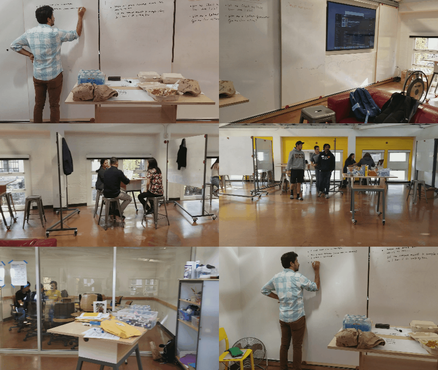
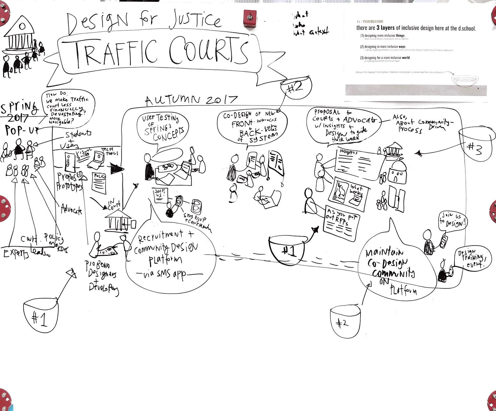
Last week, the Legal Design Lab had our third round of workshops on Design For Justice: Traffic Courts at Stanford d.school/Law School. In Spring 2017, we had a 2 month sprint to discover the current landscape of problems and solutions for traffic court as an issue of procedural justice, and one of poverty and social justice. That sprint resulted in 5 prototypes that were vetted as promising and in sync with both users’ and courts’ needs.
Then in August-September 2017, we had the challenge workshopped as part of a larger program at the d.school, in which social leaders were training on how to use design thinking to redesign large, systems-level challenges. They worked for 3 days on interviewing more people at court, also seeing the challenge from the police and traffic safety advocates’ point of view, and generating quick prototypes to improve the situation.
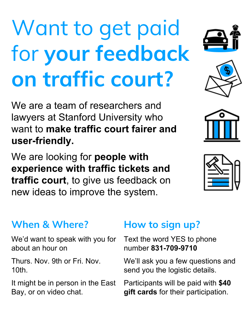
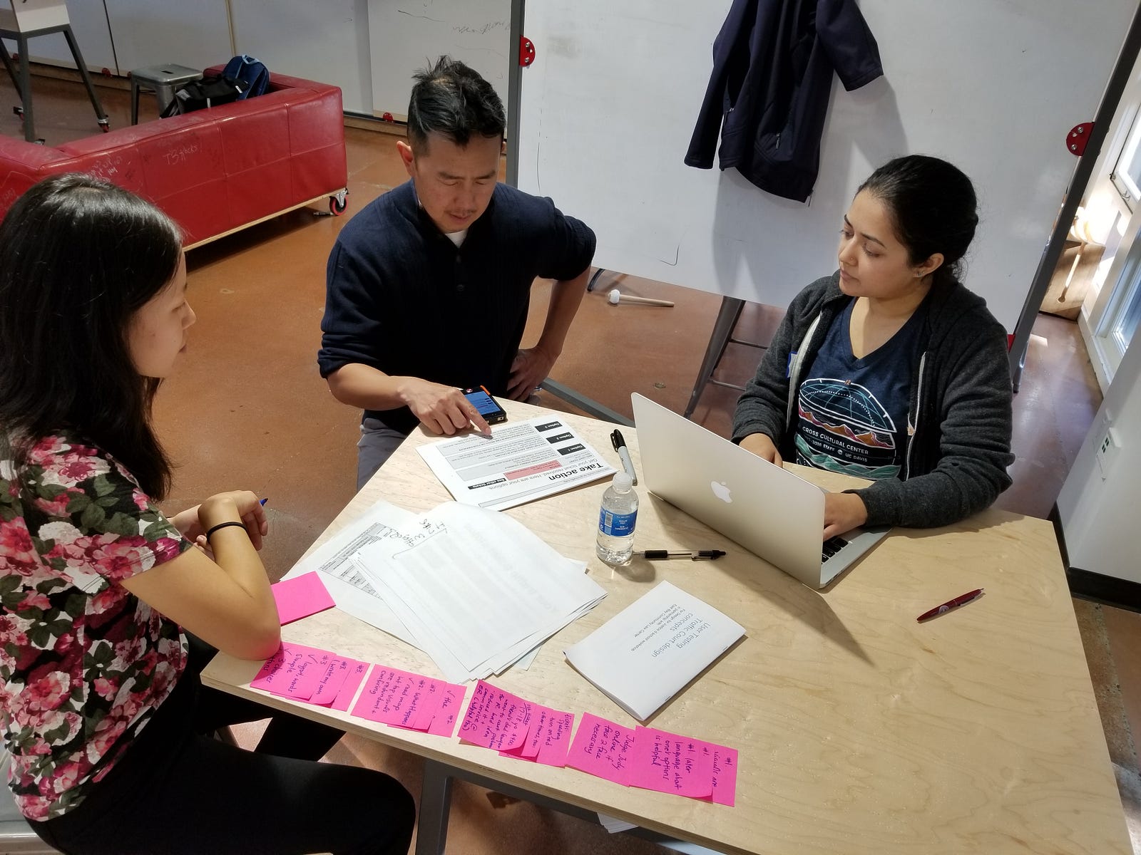
Now, we just finished a 3-day design sprint with 10 interdisciplinary students at Stanford, in which we did intensive, 1 hour tests with members of the community. We recruited people via Craigslist and our partnership with East Bay Community Law Center, looking for people who have been through traffic ticket experiences in the past, and who were open to giving us feedback on ideas to improve traffic court — as well as to contribute their own design ideas.
Our goal was to get rich feedback on our 4 prototypes and also begin co-designing new versions or new ideas:
- If we could only go forward with 1 idea, which should it be? Which seems to be the most usable and valuable?
- How can we transform these 4 prototypes so that they’re more intuitive, trustworthy, and impactful?
- How open are people to using tech to get legal help? Should we stick to paper and in-person help, or is it worth devoting resources to websites, text, and other mobile interventions
- What are new directions that we should explore, beyond these 4 prototypes that we had.
Our audience for this work was ourselves (so that we can learn what types of access to justice innovations have the most promise), but also court leaders, foundations, and others interested in defining a new agenda around making traffic court fairer.
The Four Prototypes We Tested
We chose these prototypes after our Spring Quarter class’s exploratory design sessions. These ideas emerged as the most promising, as judged by our in-court user testing, subject matter experts’ review, and our own assessment of what we could prototype within four months. Over summer, we worked on the 4 ideas to make them interactive, with real content, and, in some cases, ready for pilot. We wanted to have the prototypes refined enough that users could assess their
1. Visual Guides to the Traffic Court System
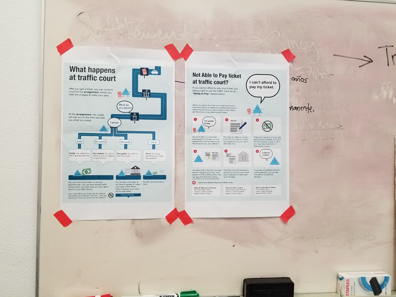
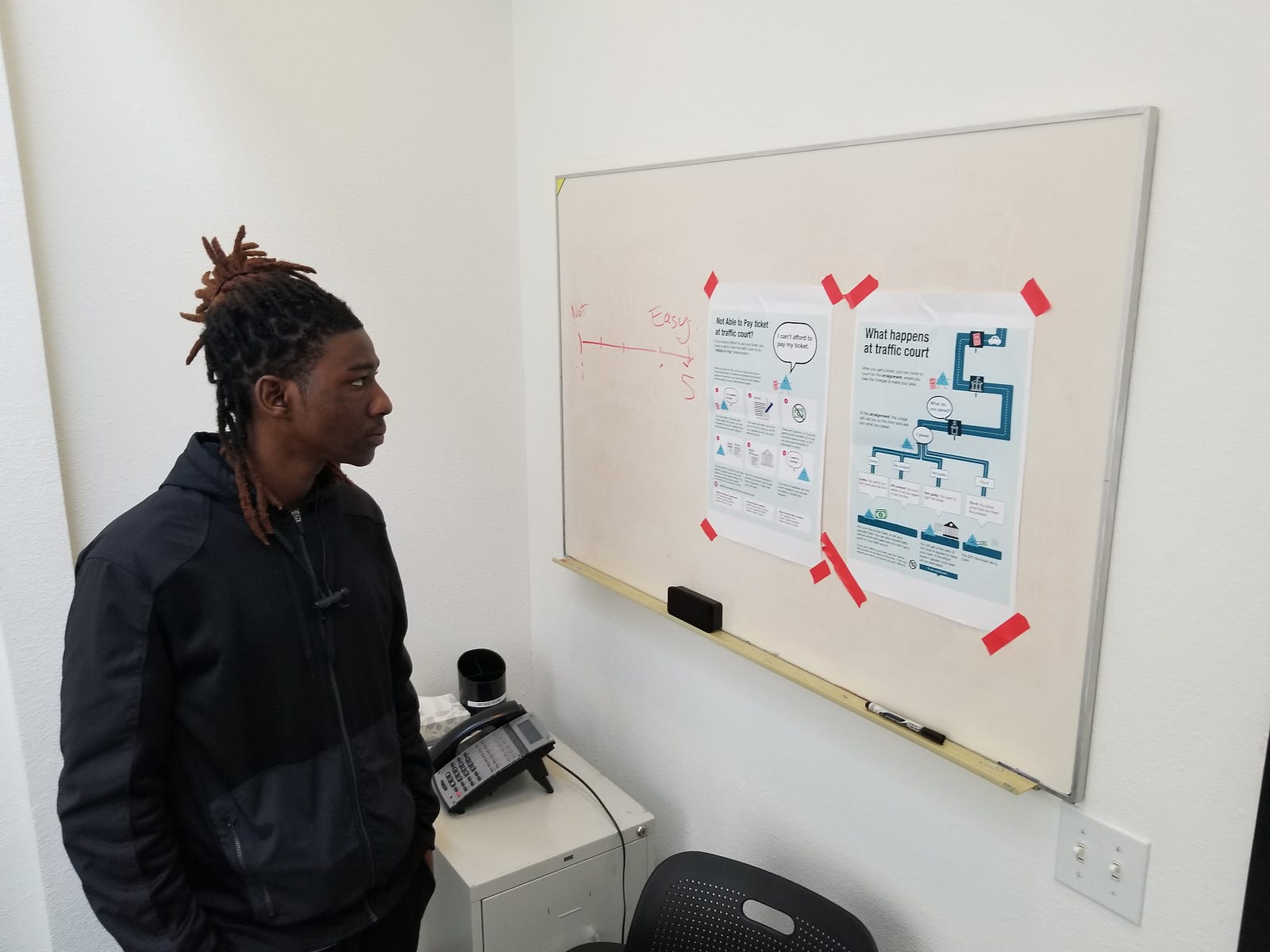
The court would provide maps and storyboards that lay out what your options are — what to expect, so you can figure out what you want to do. Our pro bono designer Kursat Ozenc had created the first versions of these visual guides — and we had done initial user tests and soft launches of them in Alameda County traffic court over the Summer.
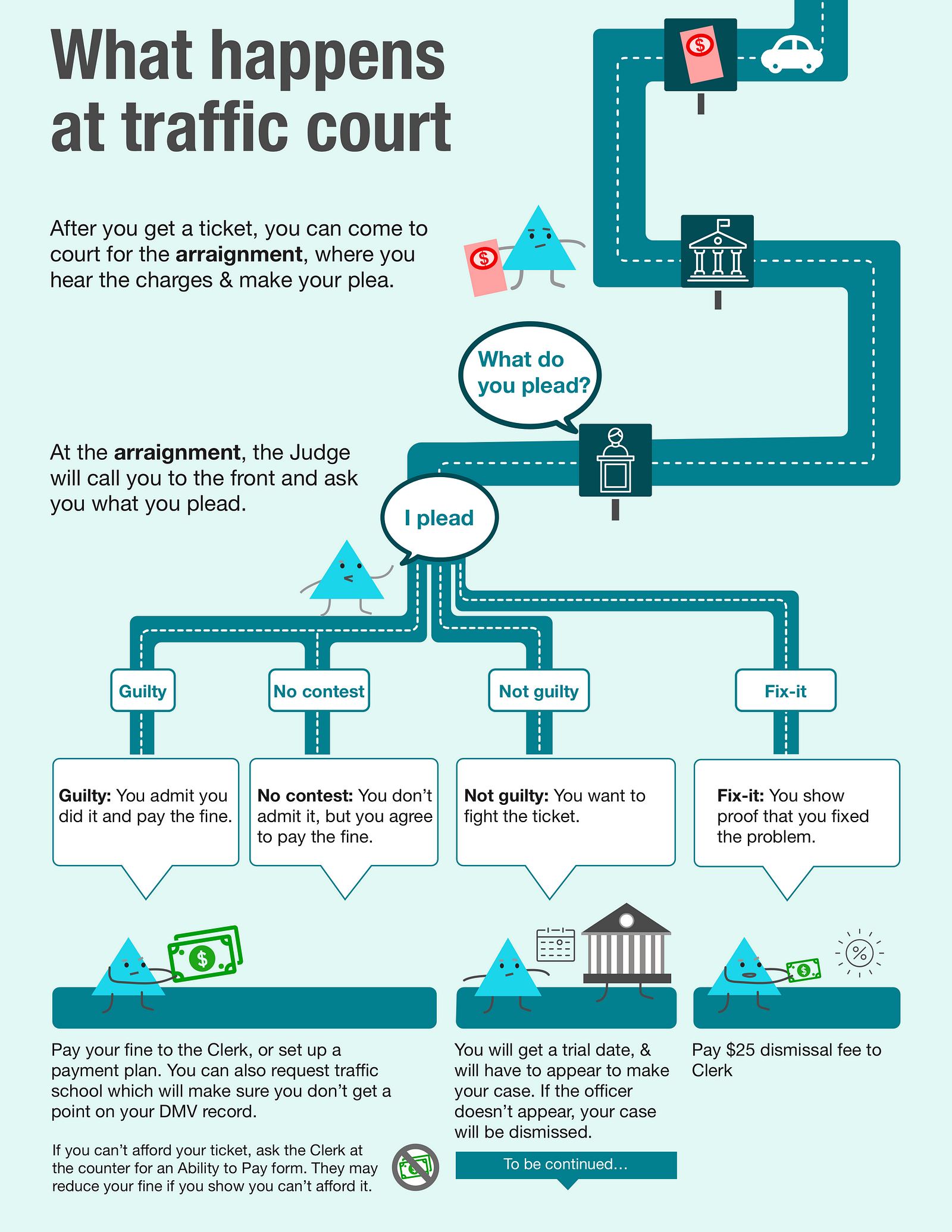
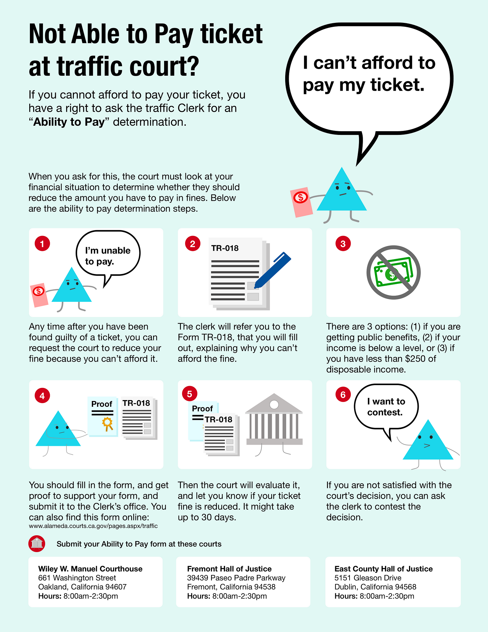
We had tested these visual guides in our Spring class and in person, to very positive feedback. We wanted to understand how valuable they were vis-a-vis more interactive, and customizable resources.
Our initial testing signalled that people wanted a clear overview of the process, and wanted to have a visual sequence of actions laid out. We hypothesized that our Triangle Character would be easy to follow along, easing the burden of engaging with this information, and leading the person through the options they had available to them. We hoped this would increase people’s planning to best protect themselves while going through traffic court.
2. Online, Interactive Fee Reduction Form
Our second prototype was an online application, through a web form, in which a person could ask the court to lower the cost of their ticket based on their financial circumstances. This is an adaptation of a new California court process, now only available via paper forms, called the ‘Ability to Pay’ application.
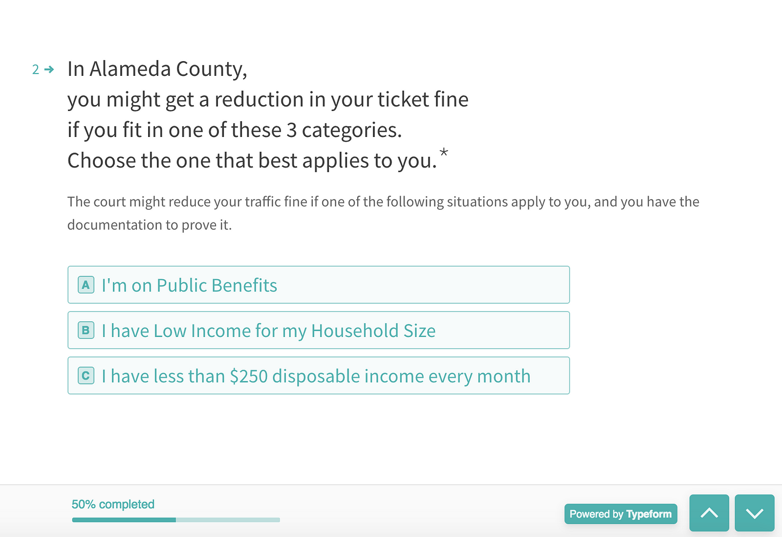
We made the prototype with the official form’s content, laid out with Typeform — to have a nice, clean UX that would be mobile friendly. You can see it — and play with it here.
Our hypothesis here was that making this process more instant, more conversational, and with evidence easily uploadable (rather than phtocopied or otherwise) would lower the burden of applying for the discount.
3. Cross-County Traffic Ticket Lookup + Letter Generator
A more ambitious prototype was our online Ticket Dashboard. Here, we created a click-through web prototype, that would let you enter in a few basic details of yourself. The tool would search through all California counties to see if you had any outstanding traffic tickets. Right now, you have to do this step county-by-county.
The tool then tells you what status the ticket is — and what action-steps are available to you. We also incorporated a Letter Generator tool — that would let a person automatically create a ‘pleading’ letter to the judge, laying out their side of the ticket story, and asking for a break. The person could download this form, send it to the court, and avoid having to appear in-person to contest the ticket.
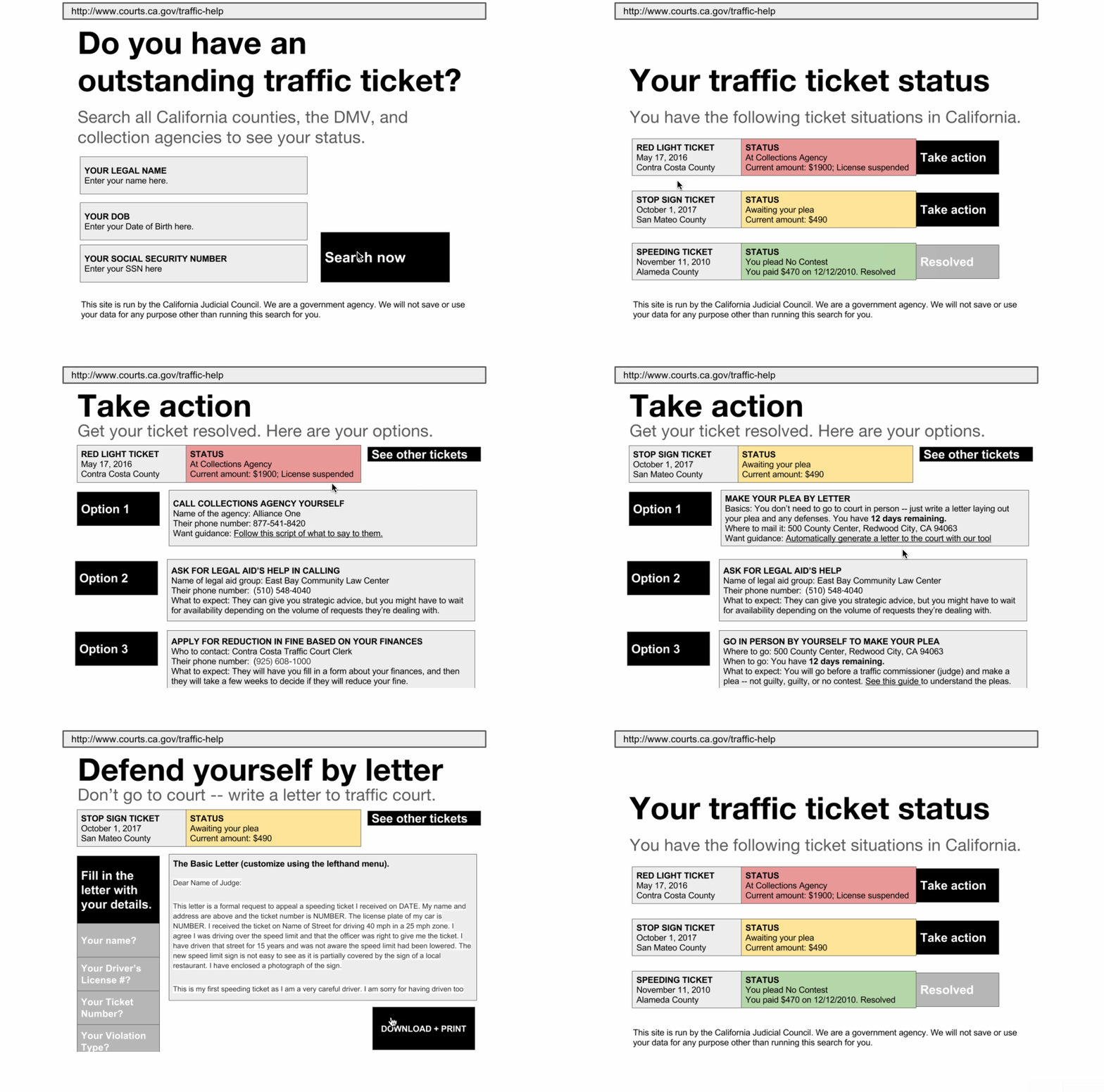
See the prototype here, as a click-through in InVision.
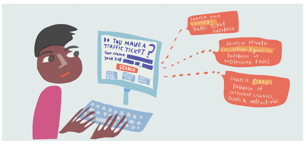
Our hypothesis with the Ticket Dashboard was that people would want a coordinated overview of where they stood — like a credit check. They would also want very clear actionable information, laying out what was in their power to make the situation better.
4. Text Message Self-Help
Our fourth and final prototype was a text message-based coach. A person could text the word “Ticket” to a phone number. They would then go through a structured set of questions and answers, that would let them know their options, logistics about what to do next, and get referred to self-help resources at the court.
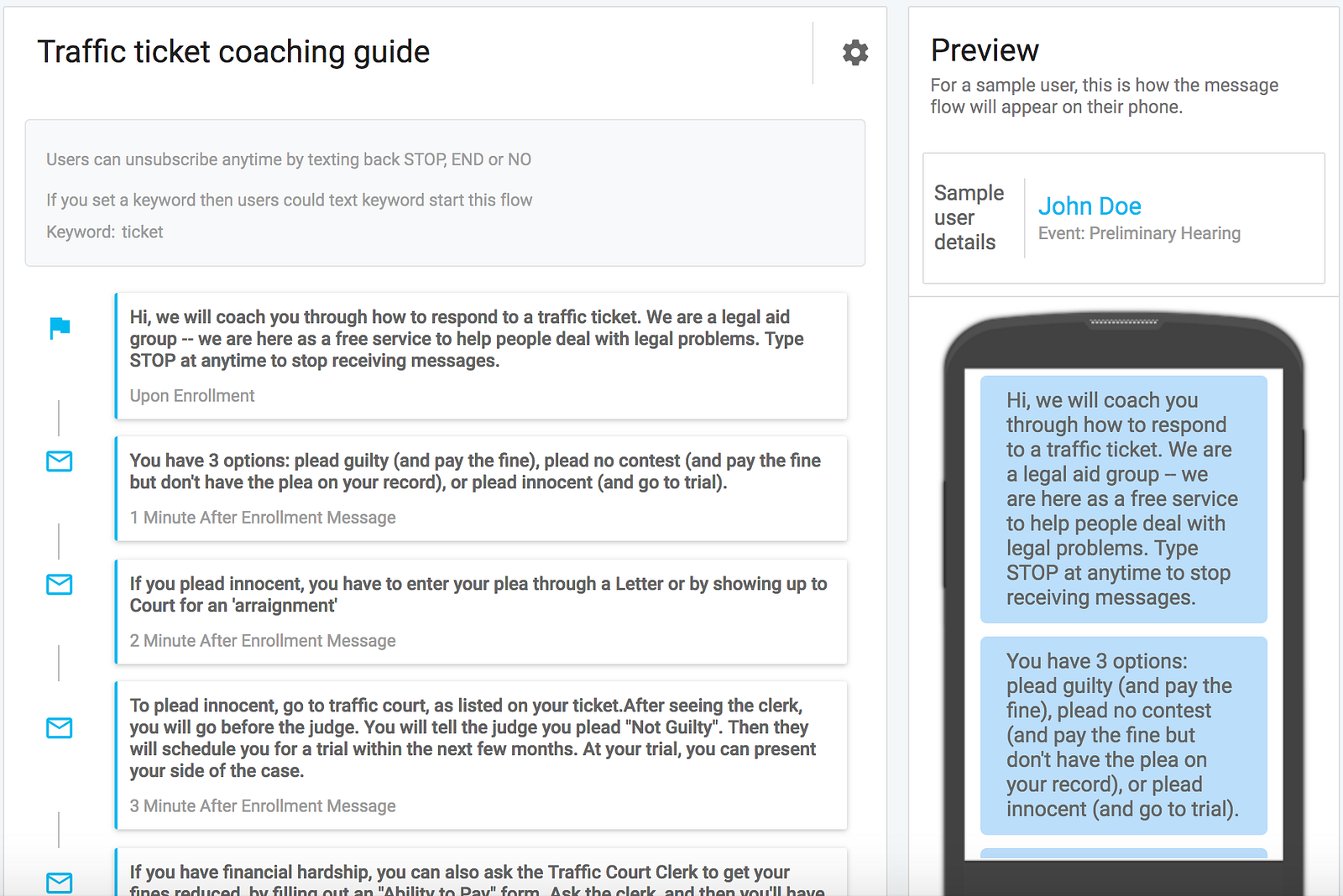
We developed this text-message coach with our new product, Wise Messenger, that allows you to create automated message sequences. We used content from courts’ self-help sites, to ensure that we wouldn’t be giving legal advice (which would be unauthorized practice of law) but rather were just giving legal educational information.
The hypothesis of the text coach was that people would want immediate, conversational support to make sense of what to expect — and have logistical information right on their phone.
Our Testing
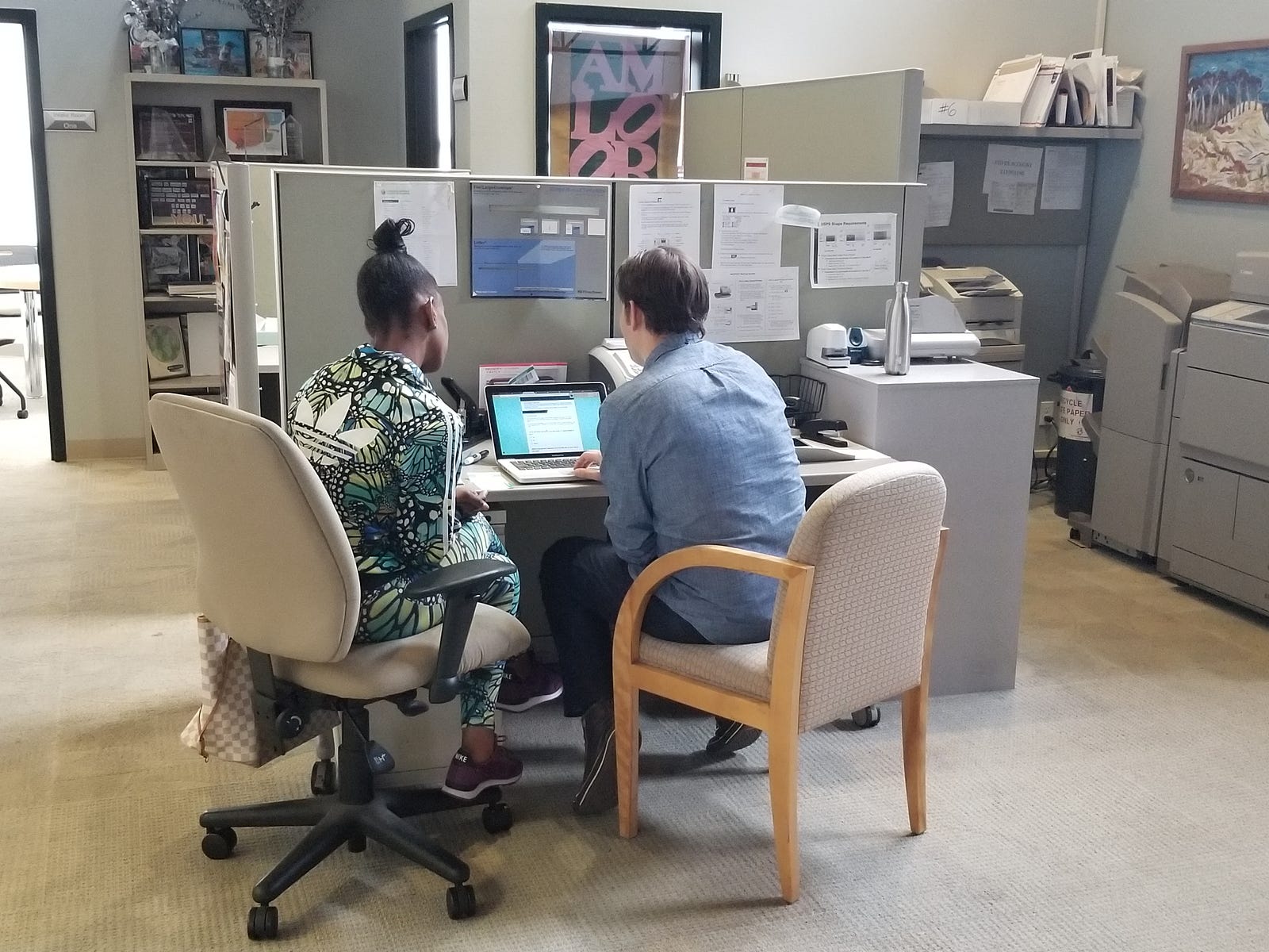
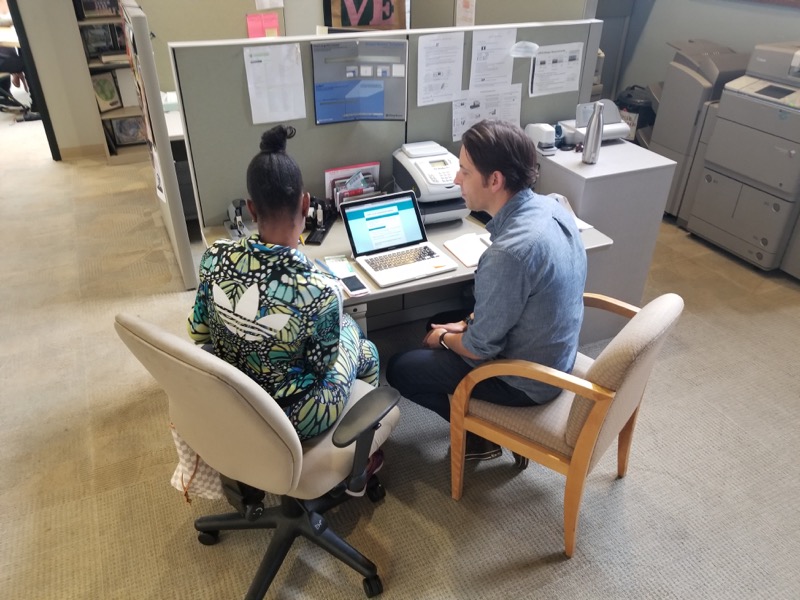
We planned for in-person user testing, with 1 hour in-depth sessions, in which a participant would interact with and evaluate each of the of 4 prototypes. We ran testing sessions with 17 people, each with traffic court experience, in the East Bay and the Peninsula.
We ran the testing through a d.school pop-out class, so we created a research team with our students. All of our students, coming from various grad schools and undergrad disciplines, had done some kind of user testing or qualitative research before. We designed a protocol that would ensure relatively untrained students would be able to conduct the tests to gather information in a standardized, yet qualitative and human-centered way.
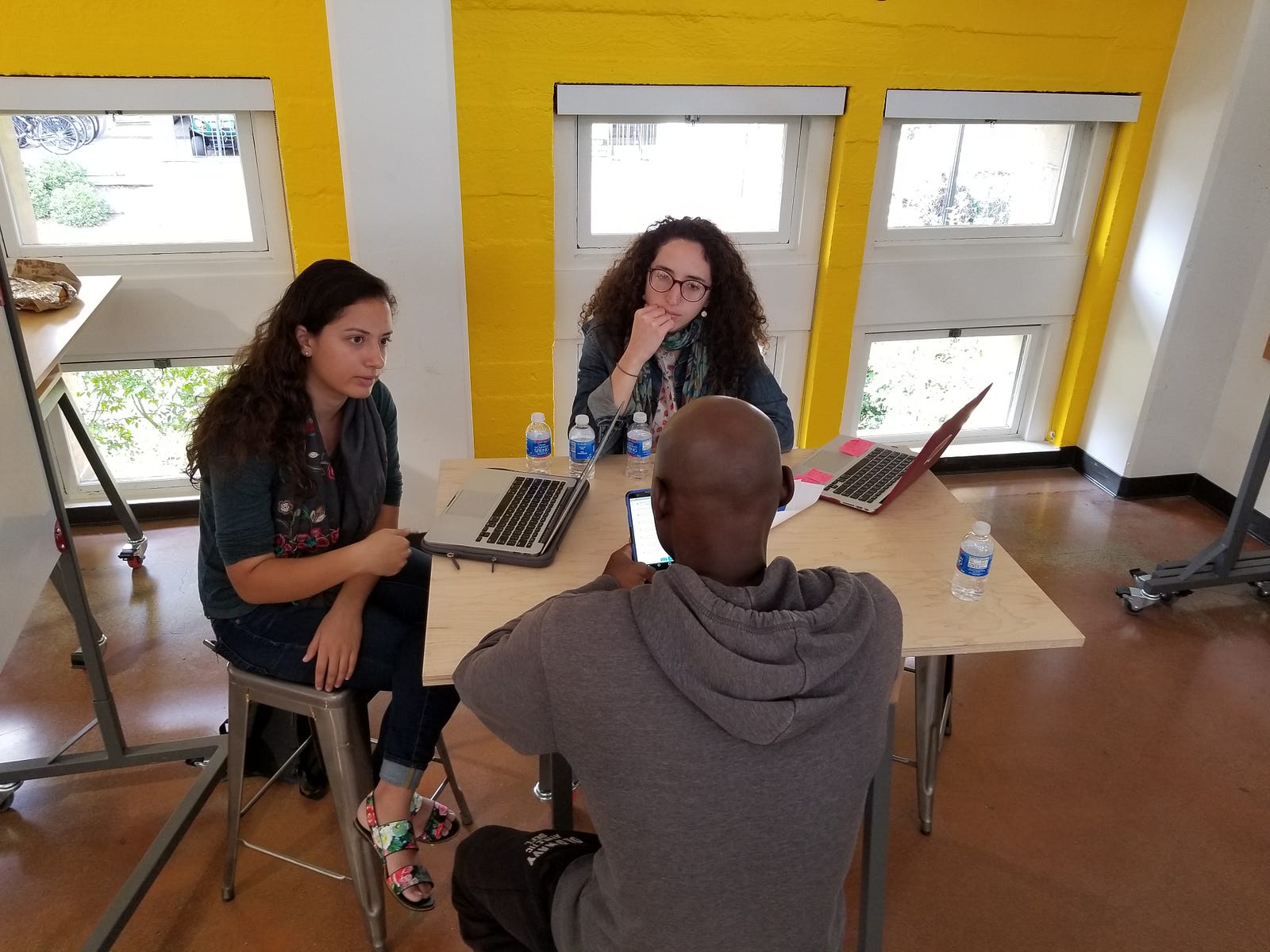
Our teaching team made a protocol on Google Forms, as well as a user-facing packet to guide them through the session. But we also let the students pursue stories and off-script questions as they saw fit, to learn more about the participants’ point of view. The feedback was meant to help us decide which prototypes to invest further in, and what we need to change about them.
The Results of our Testing
Our most direct findings from the testing were quantitative. We gathered the Likert-scale evaluations of each prototype (on a scale of 1 to 5), as well as comparative rankings of the prototypes against each other (with each participant spending $100 fake dollars among the 4).
The Ability to Pay online form scored well on usability, but many people did not think it would improve their outcome after they failed to qualify for a reduction:
Likelihood to use: 77/85, 90%
Likelihood to improve outcomes: 63/85: 74%
Ease of understanding: 76/85: 89%
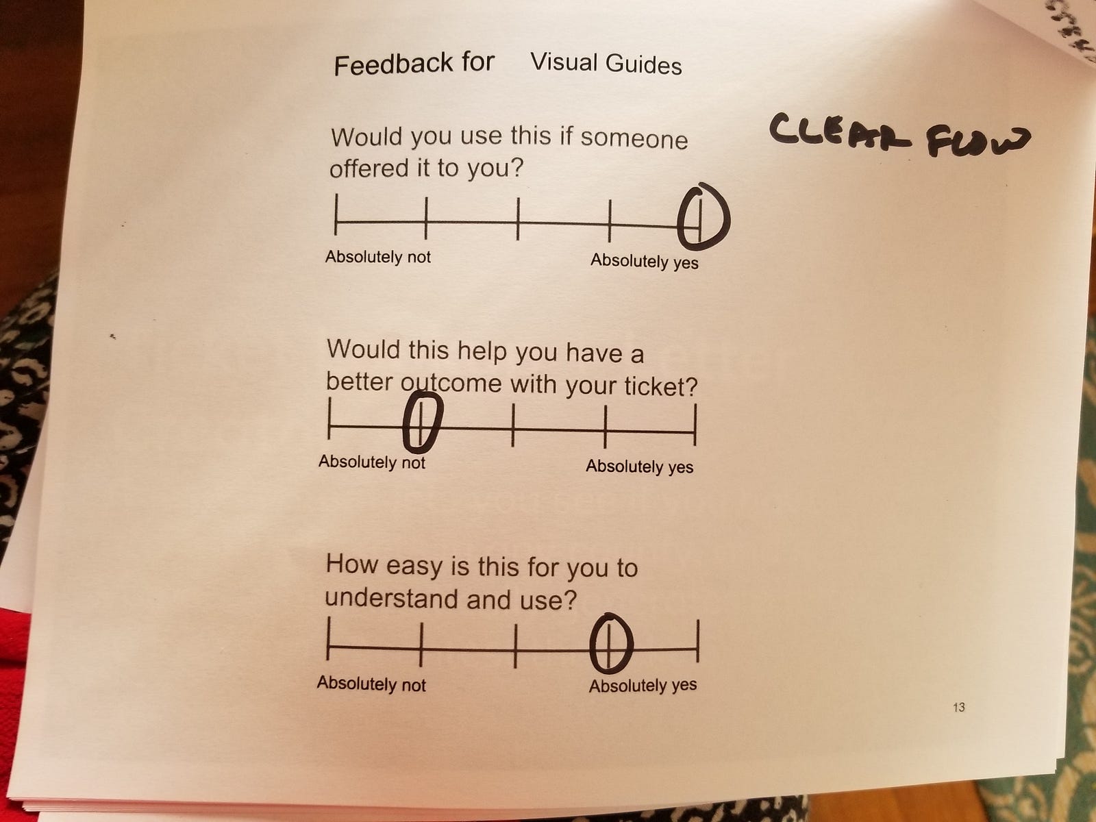
The Visual Guides were considered the most likely thing to engage with, and easy to understand — though there was still doubt about how well they could improve the person’s outcomes.
Likelihood to Use: 81/85: 95.3%
Likelihood to improve outcomes: 63/85: 74.11%
Ease of understanding: 77/85: 90.6%
The Ticket Dashboard + Letter Generator was ranked very high, and was expected to offer the most improvement of outcomes.
Likelihood to Use: 81/85: 95.2%
Likelihood to improve outcomes: 71/85: 83.5%
Ease of understanding: 79/85: 92.9%
The Text Message coach had the lowest likelihood of use, though it went up between Day 1 and Day 2 of testing, as we fixed some bugs and improved the conversationality of the experience. We saw more apprehension about this tool than the others — with testers questioning who was behind the conversation, and finding the structured back-and-forth to be annoying
Likelihood to Use: 57/75: 76%
Likelihood to improve outcomes: 50/75: 66.7%
Ease of understanding: 52/75: 69.3%
The ranking of the 4 ideas against each other, with a money allocation exercise, helped us make the comparative value more explicit.
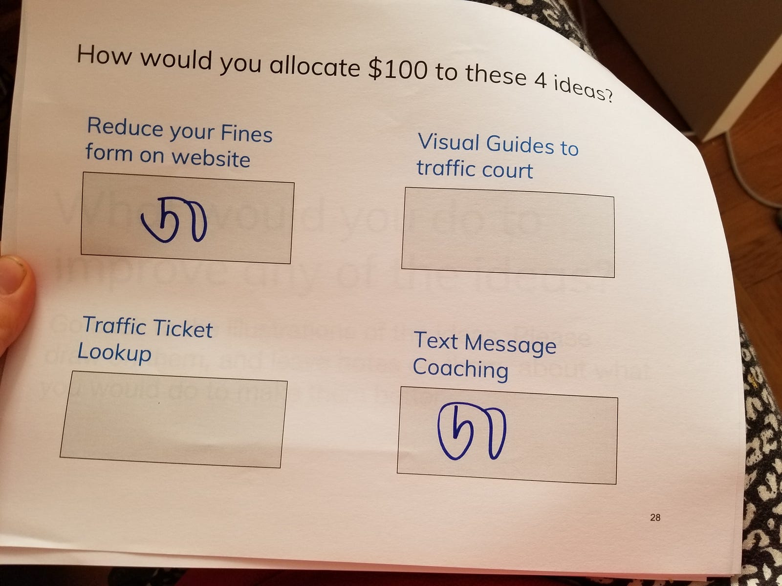
Among the 17 participants, the division of the $100, in total was as follows.
#1 Value: Ability to Pay Interactive Form: average spend of $35
#2 Value: Ticket Lookup Dashboard + Letter Generator: average spend of $31
#3 Value: Visual Guides: average spend of $18
#4 Value: Text Message Coach: average spend of $16
People valued the tool that would give them a direct financial reduction in their fine as the most valuable thing. The other tools could help them understand the system, get its logistics nailed down, and see their status. But the most valuable intervention would be the tool that helped them directly get a reduction of their fine — or at least, tell them directly if they can get this reduction or not.
From the explanations and stories that our student testers gathered, we pulled out a few major themes about how people evaluated the prototypes.
- People want transparency + action-oriented tools for their ticket situation.
- They want a bird’s eye view of the process, so they can navigate it.
- They want interactive, step-by-step, on-demand services to get the process taken care of accessibly. They don’t want to have to go to the court (except for actually negotiating their ticket — they want to be face-to-face for that delicate exchange).
- They don’t want to have to fill out paper forms, or do things that feel burdensome or hard to understand what is being asked of them. They’d rather give over information and proof with their mobile device, and with plain language back-and-forths.
Insights about Access to Justice Innovations
Beyond the specific prototypes, we also pulled out some larger themes to guide our future work in legal services and social innovation.
Frame Outreach around Financial Help
People found the most obvious, and engaging value in tools that promised to help them save money. They were eager to use the interactive form to see if they could get a break. To get people’s attention, courts can frame their outreach directly around money. This will get public engagement — people will pay attention and follow through.
That said, the language of this outreach must be clear on its face. Right now with traffic court, language is huge barrier. Term ‘Ability to Pay Determination’ is very unapproachable. Participants did not understand what it was supposed to offer them, until we explained what the process could offer them. Likewise the term ‘Arraignment’ continuously befuddled people — even those who had been through several arraignments.
These terms are off-putters. They signal that the information is for insiders, rather than for everyone. The system supposes that everyone can make sense of them, but instead they are barriers to people being able to navigate the system.
Multi-Channel Strategies for different users (or users at different points)
Why roll out a single intervention, when different people — or people at different moments in the process — value different kinds of support. We learned that people appreciate visual maps and storyboards at the start of the process. But then they want action tools, interactive checkups, and coaching. These various interventions can be coordinated into a flow of services, that people can use throughout their journey.
Moreover, the same content can be presented in different interventions, to reach people of differing learning and tech preferences. Options can be conveyed on a map, on a website, or on a chatbot. Applications can me made with in-person conversations, digital forms, online letter templates, or (again) chatbots.
We suggest traffic courts and other service providers to get their content ready once — and then present it in as many different channels and presentation styles as they can afford.
High Value of Bird’s Eye View — the Orientation Visual
The users highly value a bird’s-eye view: a high-level, Google-Maps-like presentation of how a system (like traffic court) works. The visual guide — with a process map, and a storyboard of a character taking various pathways — acts as both an orientation and a strategy document. People work their way through different paths, like a board game, to figure out what consequences they might face and which path best fits them.
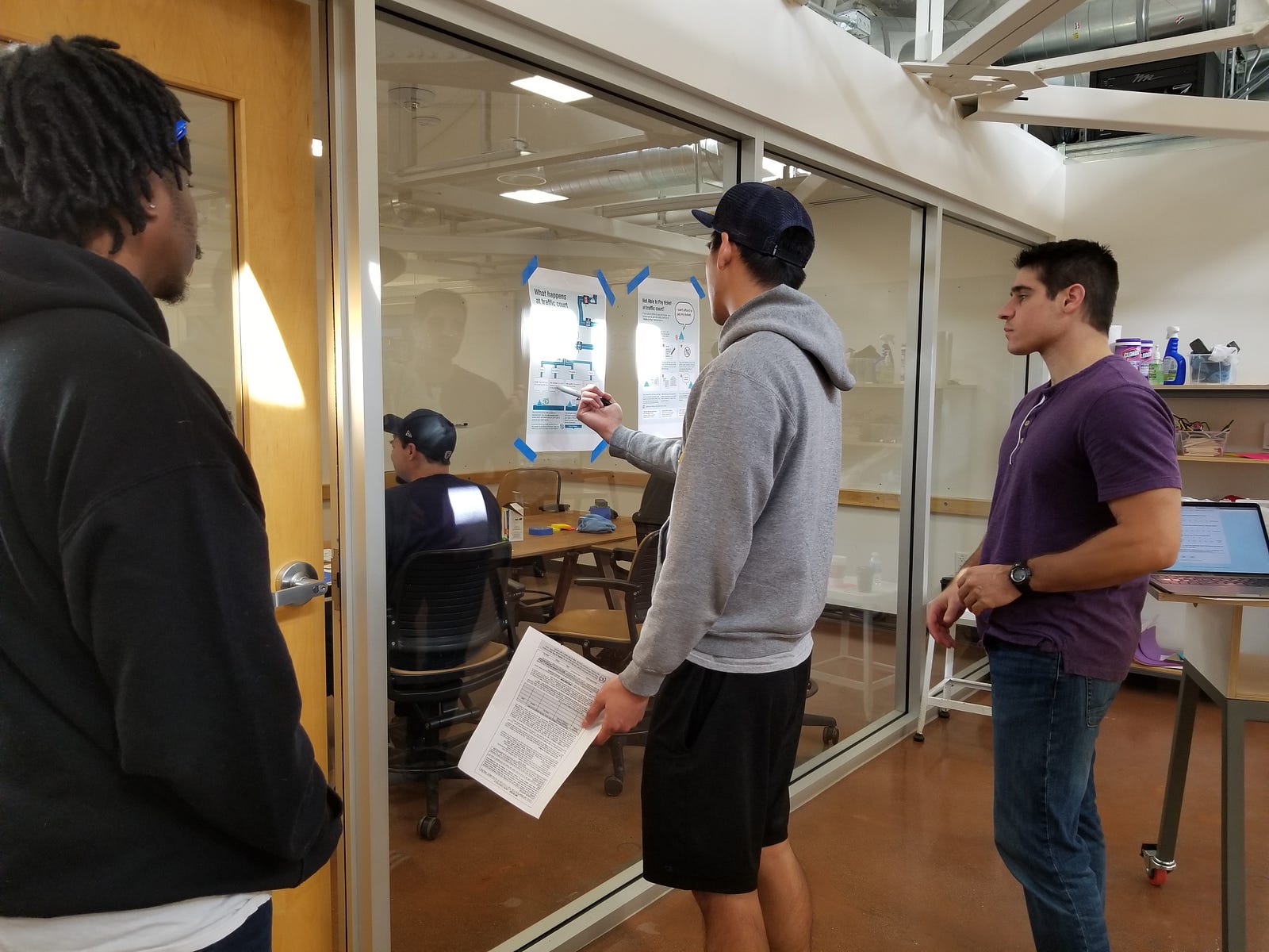
This visual can help people at the beginning of the process to get their bearings. We had several testers who had been through over 10 traffic tickets, and still had not been able to understand how the court process worked — what options they had, or what effects their choices might have.
High Value of Automatic ‘Magic Legal Words’ Generator
The Letter-Generator part of the ticket dashboard website received rave reviews. People were excited to have the ‘magic words’ of how to present tehir side of the story, laid out for them to customize. We learned that people felt they had a case to dispute tickets, but they lacked confidence in how they could communicate this case. They wanted tools like this one, that translated their plain language into legal jargon.
High Value of Customized Check-ups and Action Plans
The holy grail — what our participants wanted most of all — was a custom diagnosis of their case and strategy plan to follow. To the lawyers among us, we recognize this as traditional, high-touch legal services: a person goes to see a lawyer, tells them about their situation, and the lawyer consults their anecdotal experience, research tools, and network of other lawyers to devise the best plan for the person. Of course, full service lawyers are very expensive.
Our participants were hungry for a low-cost version of a lawyer-like experience — even if they did not want an actual lawyer. Rather than a lawyer, in fact, they wanted a data-driven tool that could look at the stats from past cases and options litigants took, and then see what the statistics told them would be best to do.
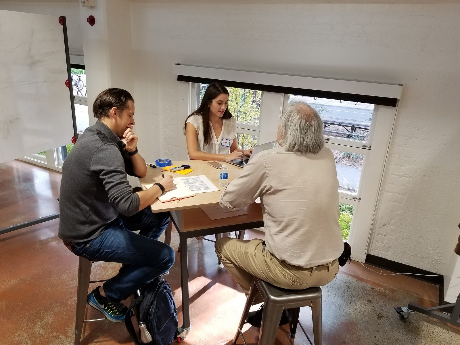
They also wanted to know the personalized consequences any action would have for them. With each tool, they wanted it to tell them the specific consequences they’d face for key factors: money they’d have to spend, harm to their driver’s license or records, their credit score, their insurance premiums, or criminal implications.
Text Only Valued if Conversational and Immediate
The text message coach, which we hypothesized would be engaging with its conversational quality, did not test well — especially on Day 1. The messages were all one-way from the system to the person. They were timed to arrive one per minute. The testers did not like this setup: they felt the messages did not feel immediate enough, and they felt the stream of messages felt like spam.
On Day 2, we changed the flow to see if another version would test better. We made the system two-way, so that the system would always ask the person if they wanted more information, or what type of situation they were in. Then, based on the person’s response, the system would send a single message back at a time.
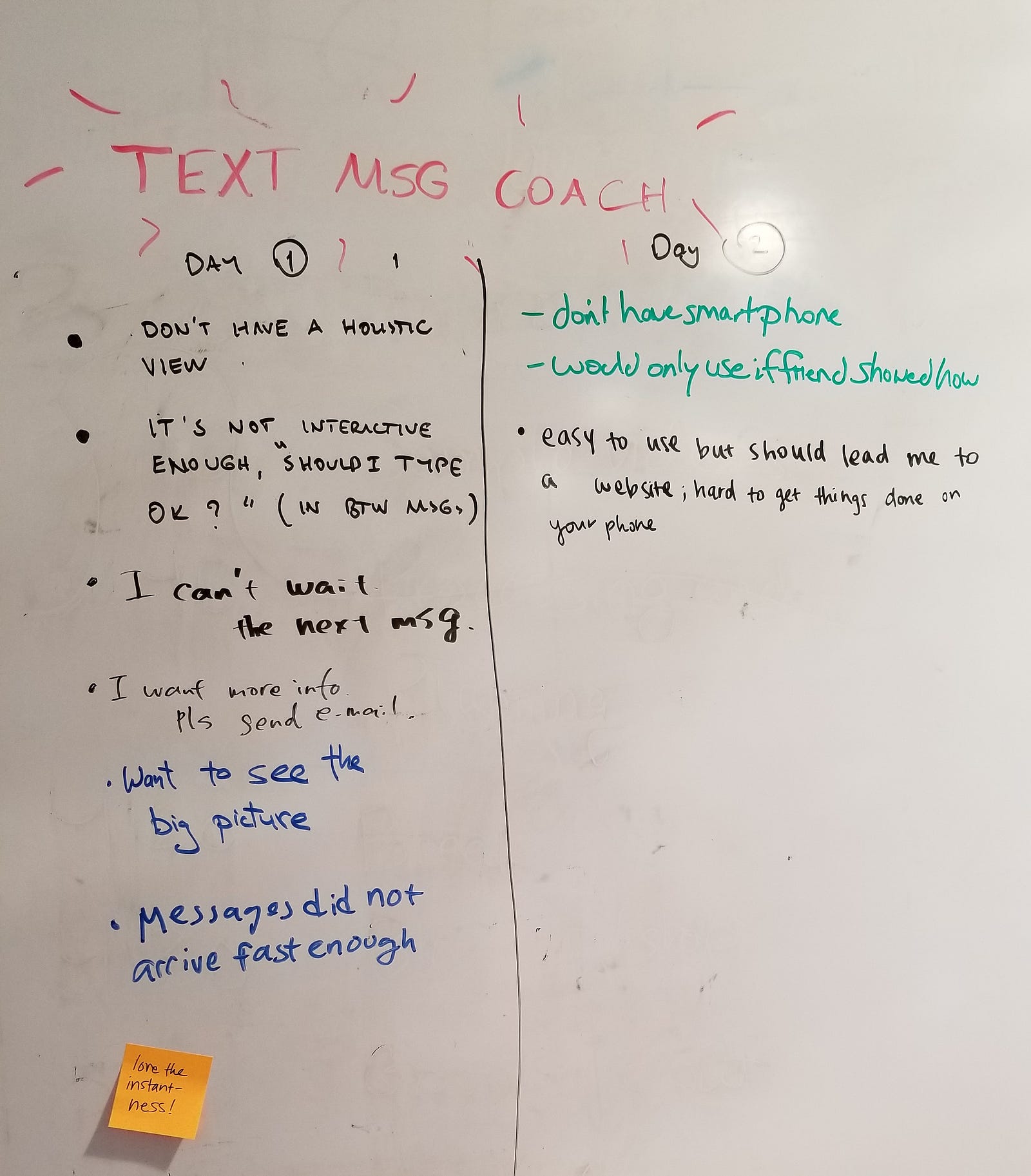
This revised flow tested better — but testers were still apprehensive about the coach. When ‘talking’ or ‘texting’ with a tool, people were very suspicious about who is on the other end, what their intentions are, and what bad consequences might arise. Any future texting tool needs better explanation at the front: who is the organization behind it, why they are providing it, and what will happen with users’ texts back.
What users really wanted was the ability to apply for fee reductions or to negotiate their tickets on the text message tool. Getting logistics and procedure information was helpful, but people wanted to take action on text.
System Changes for Courts and Police info systems
In order to make the user-desired solutions real, some changes need to happen at the ‘back-end’ of courts and government agencies. The highest value the users get is when information about fines, tickets, and case outcomes is more structured, more coordinated, and more discoverable. This can only happen when the agencies gather and share information in better ways.
In particular, it should be easier to respond to tickets instantaneously, rather than waiting for weeks (or months) for it to be entered into the court system. This needs to happen in the police and court’s info management systems — which talk to each other poorly and slowly. Why can’t there be on-the-spot ways to resolve tickets, when people most want to get it done?
In addition, when people apply for financial hardship reductions, they need to assemble proof of their finances from other agencies. They need to wait in line at the Social Security Administration to get a piece of paper, or find a letter from the agency that administers food stamps, or get the health insurance marketplace to give them a particular document. Why can’t the court directly discover talk to these agencies, to verify if a person is receiving their services? Why is the burden on the person to do this interoperation, rather than on the systems?
Making the information systems interoperable may seem expensive and exhausting, but its value would be tremendous for the public. Working groups and pilot data exchanges must be a priority.
Next Steps
We will be writing up a larger report of these prototypes, the testing results, and next steps. We also presented our work to the court executives in Alameda County, to identify what future pilot and study we might be able to conduct.
Our Legal Design Lab will further refine these solutions, explore what pilots we can launch, and then determine what rigorous studies we might run. With more pilots, we can see at a greater scale how people engage with the interventions, and how they affect justice outcomes.
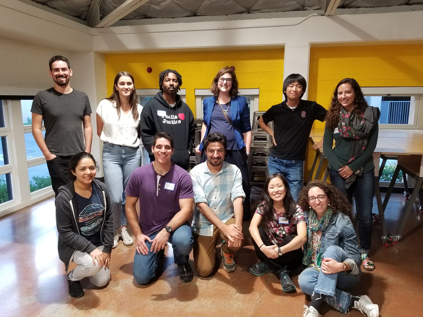
Thank you to all of our testers, and our wonderful pop-up class of students!

1 Comment
[…] can read more about our entire testing sessions and learnings at the class write-up here — and below see some of my planning notes, in which I started thinking through what we might […]