Last week I ran a session with my colleagues from Harvard Law’s Access to Justice Lab on new ways of providing self-help guidance to litigants, by using more visual and information design. It was at the Equal Justice Conference, sponsored by the ABA and the National Legal Aid and Defenders Association.
We had a packed house of people who work in legal aid groups, court self help centers, and funders interested in new, impactful legal empowerment strategies.
We presented on our own work and learnings in improving self-help materials. I showed my visual strategies and design work for Self Help Centers in California. The Harvard A2J team showed their graphic notices, with their Blob character modeling what to do to respond to a lawsuit and be strategic.
Then we led the participants through a hands-on workshop, in which they took a sample legal text — for Guardianship’s Service of Process in Massachusetts — and tried to create a visual, more user-friendly version of it. We taught basic principles, common design patterns to follow, and how to avoid rookie mistakes that lawyers end up making when first starting to take a design approach.
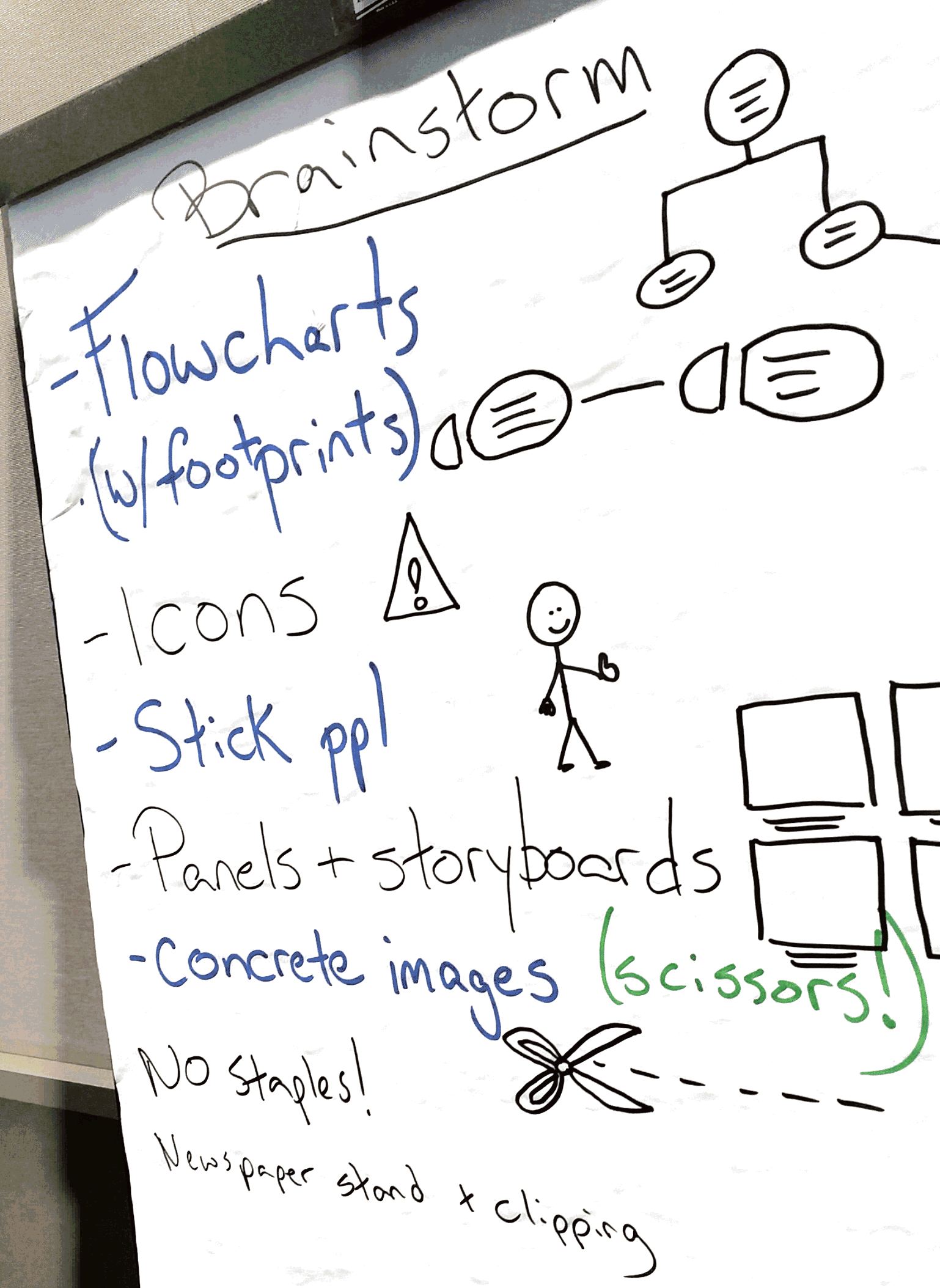
The small teams talked through a strategy for making a visual, and then went through two cycles of sketching, sharing, and refining within 30 minutes. We ended up with several different possible strategies: flowcharts, timelines, checklists, storyboards, and annotations.
Some of the lessons that Harvard A2J Lab will take back to their work on these visuals are as follows:
- Flowcharts and timelines are two of the most powerful visual patterns for complex legal info
- Embrace icons
- Stick people are good enough — you don’t need complex pictures
- Use images to model behavior, and make abstract concepts very human and concrete (like with scissors when you need to cut something out)
- Don’t staple paper guides
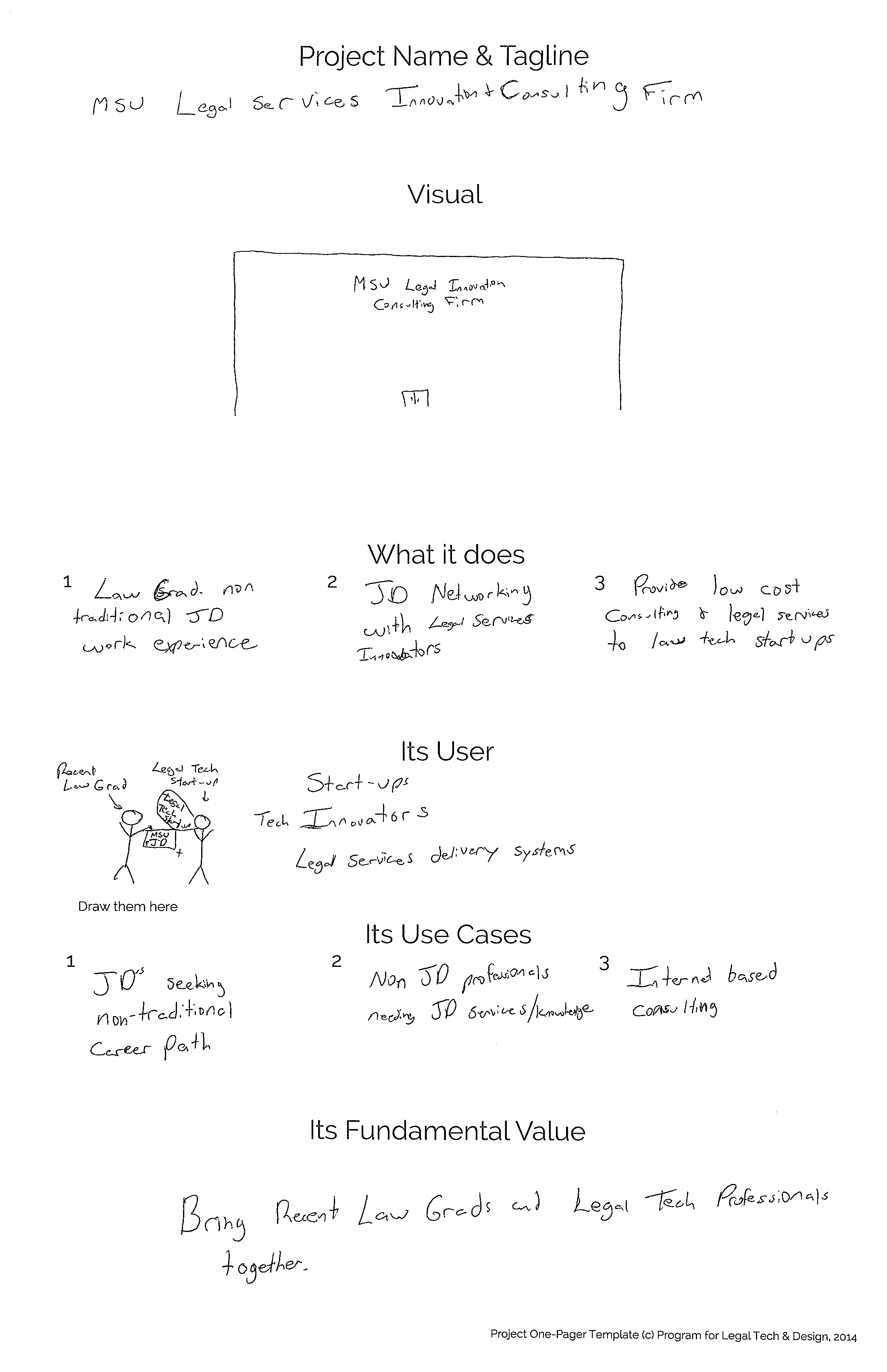
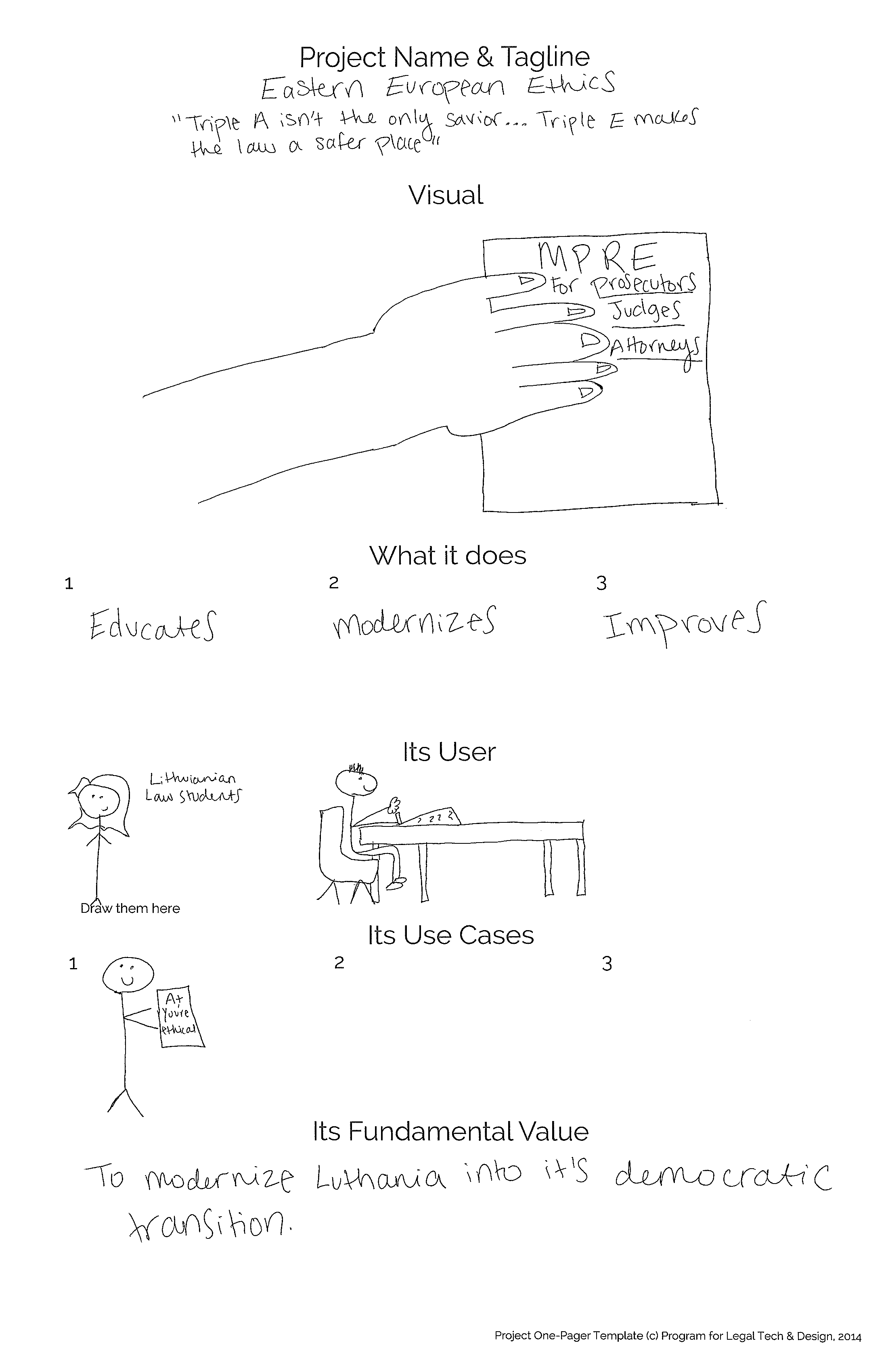
We collected some of these sketches that teams made, in the quick turnaround of 20 minutes. See below for the start of wonderful new designs for guadianship self-help!


