One of the central challenges in making more user-friendly legal help has been “How do we help people understand what options the legal system (or the government) has for them?”
Sometimes this is called triage, or screening, or eligibility checks — but it’s about the same central problem: diagnosis. How do you make the complicated legal system make sense for your own particular situation? What rules and benefits apply to you?
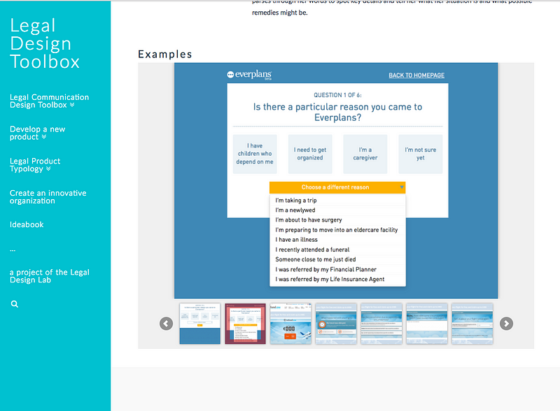
In or workshops and development work at Legal Design Lab, we’ve played with different models for smart triage: flowcharts to put up on the wall, iPad apps with visual scenarios to choose from, big textual checklists, and human stories that you can read through and choose which best fits you. We’ve even made a page of inspiration of triage patterns from others’ work.
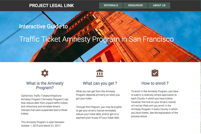
So when Sacha Steinberger reached out to us about creating a screener and guide for a San Francisco ticket amnesty program, we jumped at the chance to develop a web app with her. Sacha is a lawyer and founder of the excellent Project Legal Link, a training and referral project to help social service networks spot legal issues for their clients, and refer them to legal help.
Her challenge to us: could we make a triage screener to embed onto her existing site, that would let anyone screen themselves for whether they qualify for SF’s Ticket Amnesty program. People have a limited window (until March 31, 2017) to avoid penalties for their parking ticket, but they must qualify, based on a whole lot of confusing dates, restrictions, and if-then conditionalities.
So, my developer partner Metin Eskili and I set forth to create a smarter, more user-friendly kind of triage. We had a few requirements to start with:
- It should be in plain language, so that each question for the screening should be easy to answer, and clear what it means.
- It should feel like a quick, breezy conversation — not heavy, confusing, clunky, or intimidating.
- It should give instant feedback, without reloading screens — but it should also not dump too much info or questions on one page, to overwhelm the user.
- It should be multi-modal, with displays for both power-users and newbies.
- It should be transparent, letting the user understand how they got a diagnosis, and let them change their responses to see how it affects their outcome.
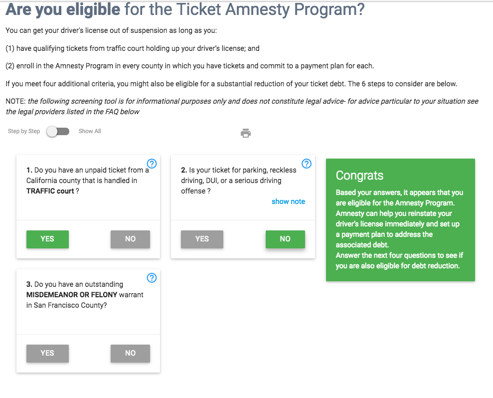
So with those design guides in mind, we developed a new kind of screener — with a progressive series of diagnostic questions as cards on a single page.
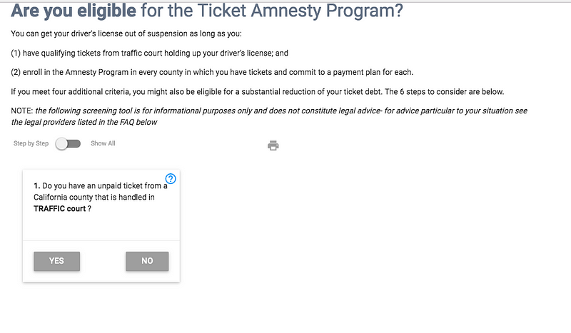
The user can see one question at a time — the step-by-step view. As soon as they answer a question, a new card pops up with the next question for them. Once they get through each bunch of questions, the diagnosis is shown on a panel right next to the questions.
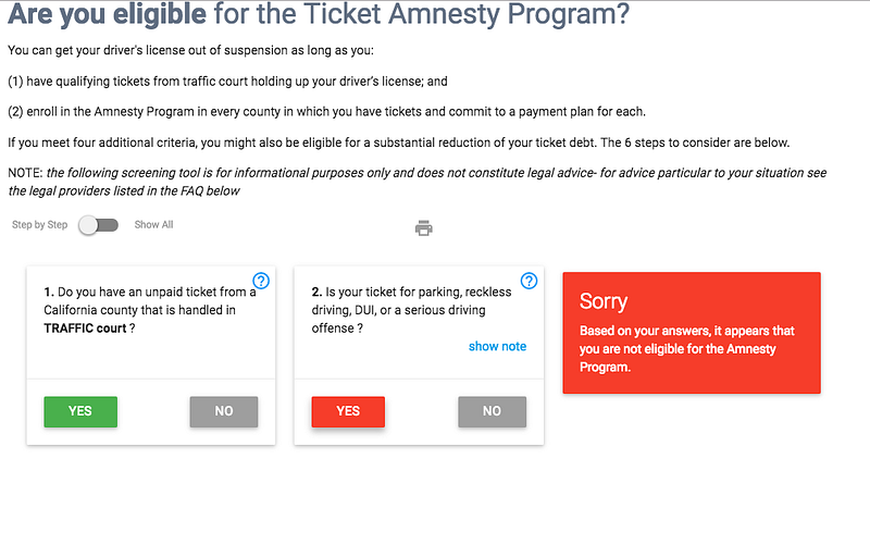
Once they get through each batch of questions, a diagnosis is shown on a panel right next to the questions.
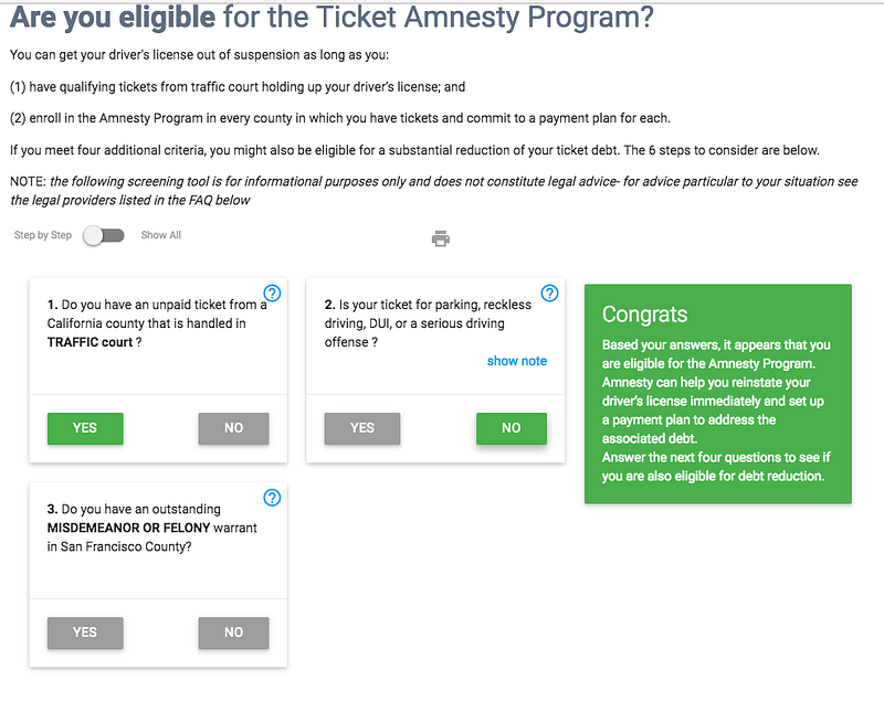
There are actually two parts of the Amnesty Program to screen for, so once a person gets diagnosed as eligible for the first part, it then immediately takes them into a screener for the second part.
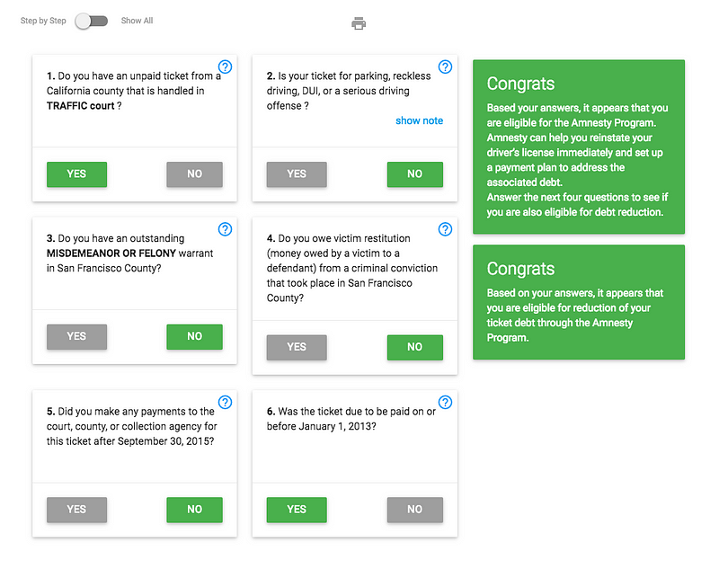
All of the screening happens on a single page, and the new questions and the diagnosis outcomes load instantly upon a user’s input. We also decided to add the follow-up steps immediately after the screener. Once you know what you can apply for, we show you a procedural guide on how to get Amnesty.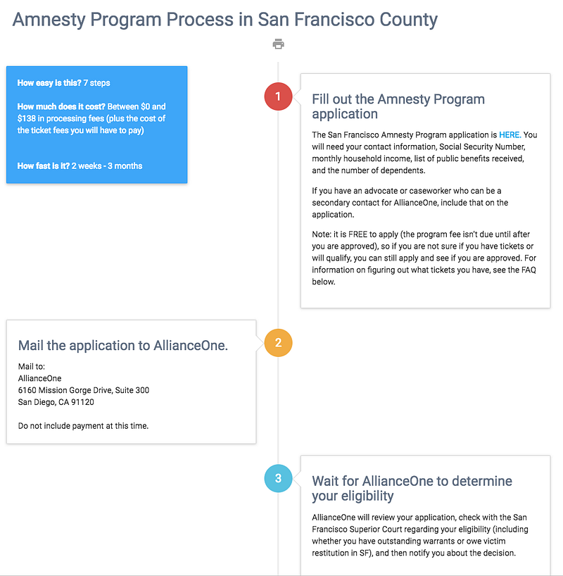
We launched the app on Sacha’s Project Legal Link site last year, so that she can integrate this screener and guide into her larger suite of resources for legal help.
We encourage you to check it out — if you have traffic court tickets in SF, or if you are interested in better tools to screen people for help options. Let us know if you have other ideas of how this model could be applied!
