One of the Legal Design Lab’s main projects this school year is A Better Legal Internet. We’re exploring how we can make all the many resources that are provided for free online, to help lay people figure out their legal problems, be more user-friendly.
Our research has pointed us to a big demand for official, government-provided guides for issues like divorce, eviction, employment problems, child custody, and debt. People want to have help from official, court sources. When they search online for help, they want to find and use court sites to solve their problems.
The problem, though, is that they find these sites hard to use. They are often overpacked with information, with lengthy passages of text, lots of legal jargon, and complex navigation. Also, most of these sites aren’t friendly for mobile devices.
We’ve got several projects in the works to demonstrate how legal help could be better provided online (see our effort to create more machine-readable and searchable resources, here in our earlier piece). And we have one that we’ve just launched — a Design Review for court and other legal help websites.

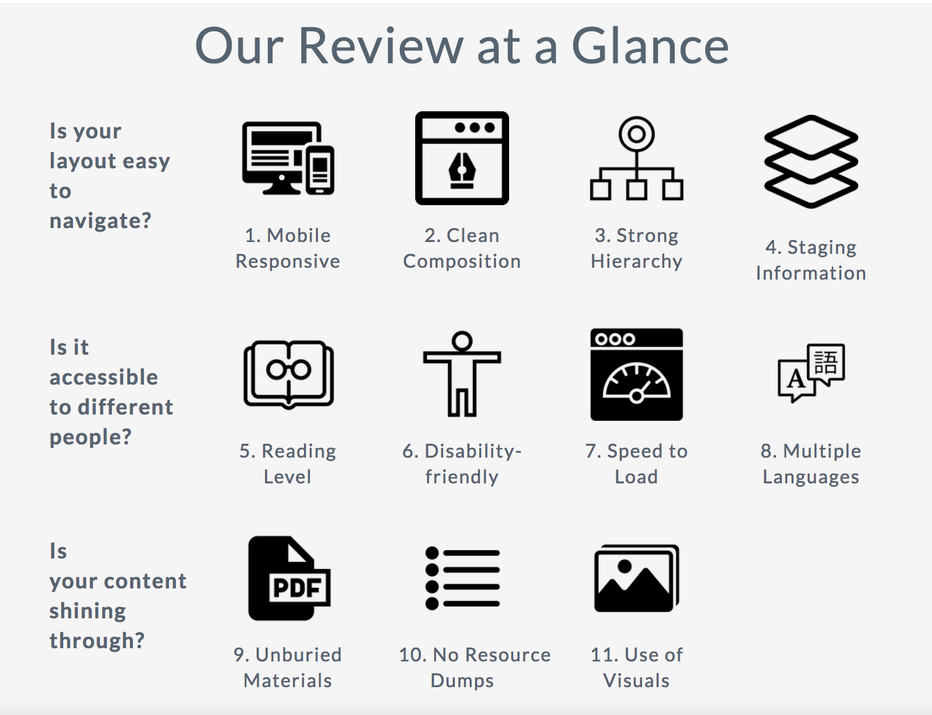
We’ve identified 11 key issues for a well-designed, user-friendly website of legal help resources. For each issue, we’ve laid out what it is, why it’s important, and heuristics to figure out how you measure up — as well as what you can do to improve it.

This is our first version of the Legal Help Design Review — so please send along any notes, feedback, and additions to help us make it better.
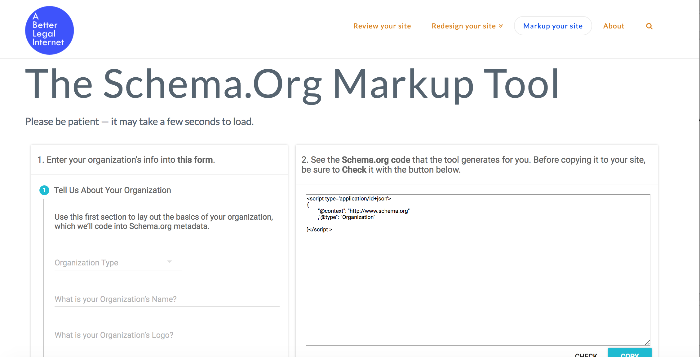
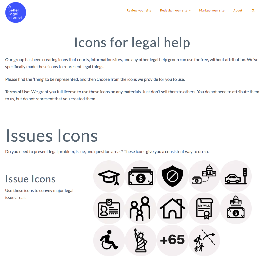
You’ll also see on our site that we’re providing design resources and a standardized markup for legal information. Those are in working mode, so you can see some of our principles, icons, and markup details — but they aren’t ready for prime-time yet.
If you are a court or legal help webmaster, please tell us if there are other resources or support you might need to make your resources as user-friendly as possible.
This post was originally published over at our Medium publication Legal Design & Innovation.


