I have been working over the past few weeks to draft up some clean, guided one-pagers for California Self-Help centers in courts to give out to people who have come in for legal help. These handouts are meant to be a follow-up and follow-through tool for the lay person, for an issue that the Self-Help center staff cannot help them with but which they also cannot tackle themselves. The objective of the handout is to get the person to
- Realize that this legal issue/question exists
- Think about whether it might apply to them
- If it does, then (not deal with it themselves but instead…) seek out legal help to deal with this issue
- Know enough about the law to be able to find the right kind of lawyer & to know what to talk about with the lawyer
A tall order, I know, for one page in large font & plain English, but a fun design challenge to tackle.
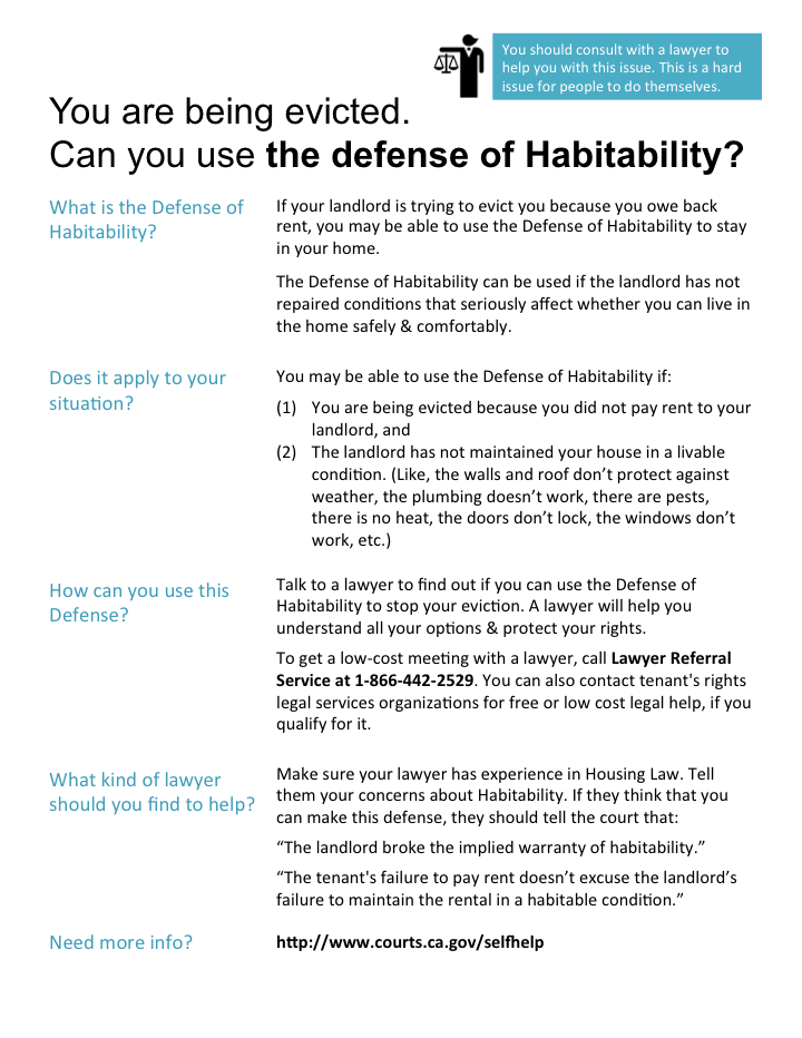
Here is my current design for a sample issue — the Defense of Habitability for a person being evicted to use in their defense.
What do you think?
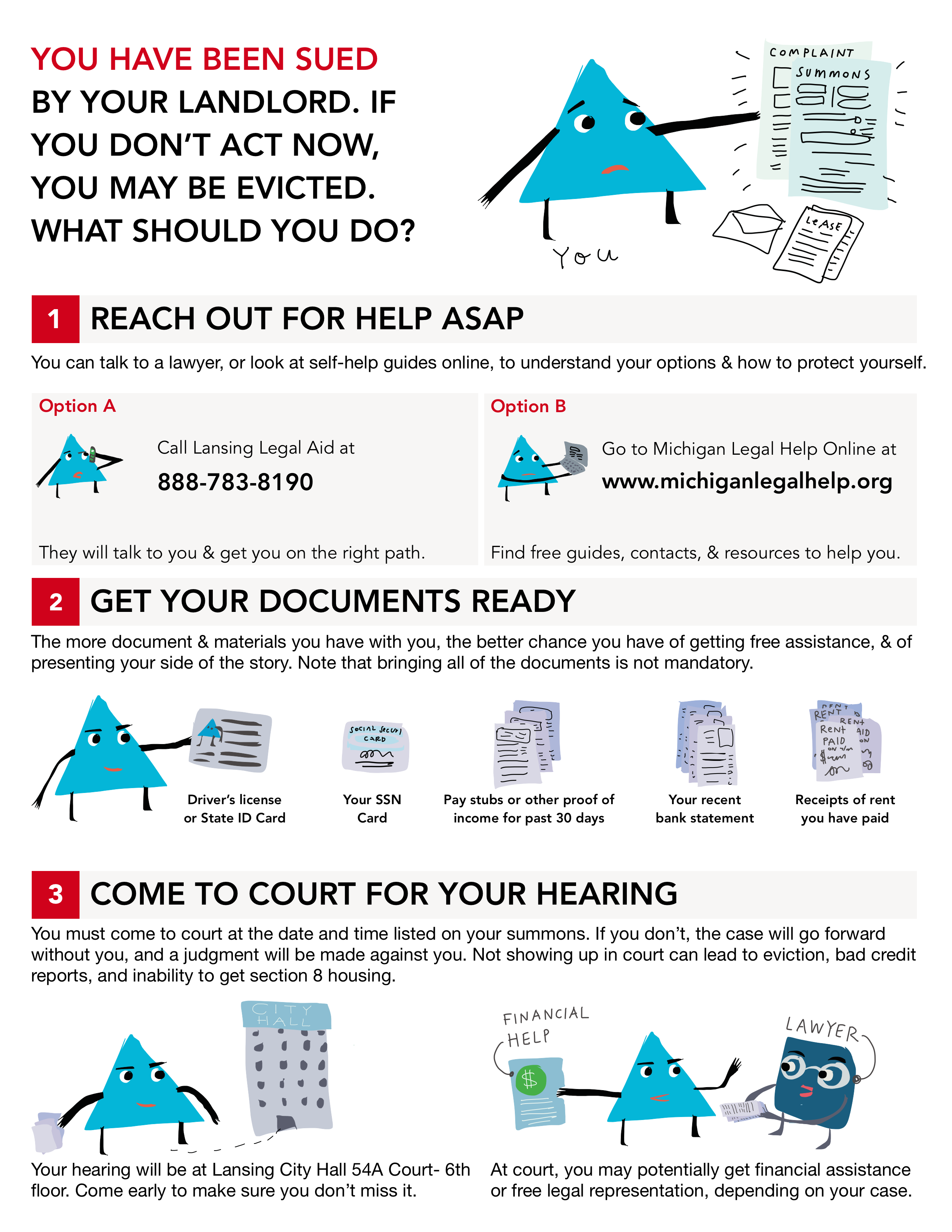
Here was an earlier version, that I scrapped for being too complicated & also being too much like a law school-oriented handout. I saved its conversational tone but scrapped its copy and hierarchy because it was written like I wrote my law studying resources — and the audience is not law students who obsess over legal rules, but lay people who just want to know what they should be doing and what options are open to them.
I also realized that less images could be better — easier for the Self-Help centers to print in mass, not deal with color issues, and more white space for people to take notes on the sheet is better than the pictures. Do you agree? Should I put more pictures onto my design, or leave it relatively picture-less?
Here are some of my very first sketches for the one-pagers:

The goal is to create a basic template of composition, colors, fonts, and visual language that the Self-Help centers can use for a variety of different legal topics. It could be for more DIY issues, or more Use-A-Lawyer-For-This issues — but the main constraint is to be 1-page or less, and to be in the plainest of plain English.
Here are my notes about design requirements & user scenarios:
Do you know any other examples to be borrowing from, or do you have any design critiques/suggestions for me? Please send them along, this is a work in progress!


