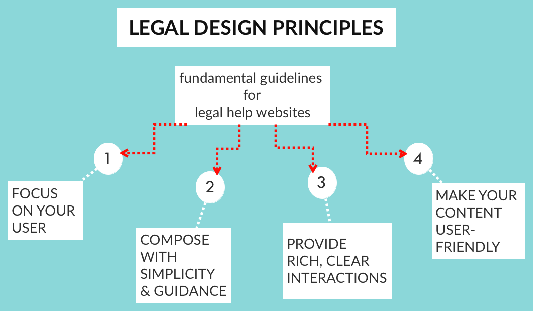
Two of our projects — the Access by Design Working Group and The Guardianship Legal Navigator — have converged on one point: what are some of the core design principles that should guide any legal website providing help to lay people?
I’ve been sorting through observations from the Working Group as they review the California Courts’ self-help site: what they find is not working, what they recommend, and what principles they’re invoking. And I’ve also been collecting & reviewing all kinds of legal services sites to find patterns for the Guardianship Navigator, and making my own observations of what good web design looks like for legal help sites. Finally, I’ve drawn from my user research on how lay people approach legal websites and what frustrations & preferences they have.
Out of this work, I’ve drafted a preliminary set of Design Principles for Legal Help Sites. I intend these for anyone who is creating or who maintains a site that provides legal guides, education, and/or resources to users who are trying to accomplish a legal task. They are particularly intended for sites aimed at helping a lay person through a legal process.
This is a first draft — please send comments & edits that you have in the comments!
- Discover Your Users: Do research and collect data about who will be using your site. Build personas — fictional composites of your most common users. But know that all users of a legal site typically have a defining feature: They feel dumb about the law. But they also want to be strategic.
- Know your User’s Motivations, Tasks, Mode, and Mental Models: Know what query/question/problem your user is coming to your site with — and answer that right away. Look at your past data, do interviews, find out what the most common missions users of your service have. Do everything you can to address this as soon as they first engage with you, to let them know that they’re in the right place and make it easy for them to get their motive satisfied.
- Build around use cases: Frame the solutions as responses to particular problems/personas. Use the persona & user research you have done. Give distinct entry points and paths for different users you’ve identified.
- Design for the Most Unsophisticated User. Even if they are experts. Even if they are law-savvy. Even if they are well-educated. You can give shortcuts to more sophisticated information. But start with a hierarchy and orientation that is eminently clear — and let the experts unbury the sophisticated information or bullet straight to it via some ‘expert touch points’. Guide everyone else, the majority of your users, with a strong, clear design.
- Strike the Balance of Guiding the User & Cutting the User Off: It is your obligation to support your user & guide them strongly. At the same time, you cannot deprive them of choices. You can not cut off options for them to pursue their rights and opportunities, even if it makes your design ‘less clean’, ‘more confusing’ — or it goes against your instinct about what’s in their ‘best interest’. It is up to them to make the choices, you can only do so much — and you shouldn’t over-design them into a corner.
- Orient your user immediately as to what path they may want to take. Present a roadmap that orients them, that lets them see what you have on offer & where they may want to go. Anticipate what they will likely need & tell them the pathways to get the information & tools to get them there
- Give relevant Entry Points to your site’s resources. Present scenarios or personas as entry points. First present the most basic possible pathways (likely, categorize the type of legal situation you’re dealing with, choose a ‘type of law’ path).
- Build a Clear Hierarchy: Present information in a clear, thoughtful hierarchy. Only disclose what is necessary at that moment. When you do present it, make sure it is presented with clear logic & rationale.
- Do not present long lists of resources. Present resources in categories based on answers to specific questions (how to solve this need? how to accomplish this task?). Do not present alphabetic lists. Categorize and group them. Present indexes based on how your user understands her problem, names her problem, categorizes her problem. That is not usually be the first letter of a term for the problem — a term she may not even know.
- Stage information. Present very limited information in the first place, with a limited set of options that the user can pursue — and gradually uncover more specific, in-depth information she is seeking out. Have a comprehensive set of information on your site, but do not present it at first. Let the user unpack it if she wants it. Otherwise, give summaries, shortcuts, headlines, and other ways to digest main points without having to spend time reading through comprehensive explanations, lists, options, etc.
- Be consistent, be familiar. At each step, have a consistent template of information you’re providing to them. Borrow these patterns from other dominant services and products in your area. Put your user at ease so they know what to expect, where to find things, how easily to scan & shortcut through your material.
- Create a Dominant Flow-Pathway. Have a path of least resistance, especially for the new user and the naive user. They want to just flow through process in the quickest, least thoughtful way possible (the ‘No-Brainer’ mode). Make it easy to stay on path — don’t give lots of other options or pathways when they’re on a path. If most of your users are naive to the experience or content, then rein them in. Give them more of a single-use path, that lets them accomplish a task with very clear & strict direction from you.
- Give Shortcuts: Especially for expert users, allow them to jump off your dominant flow-pathway. Give lots of shortcuts to find the right bit of information for the user who is coming to the site ‘with a bullet’. Right from the first page, let the user go to the Specific Tasks that she wants to accomplish, through a search box, an index, or a common-shortcut list. Don’t lock your user into the dominant-path. Do not make them feel trapped. Let the user ‘Off-Road’, wandering farther afield, to dive in more, to try things out, especially if they are in expert mode and want something very specific. Give these off-roaders the ability to undo, reverse, and go back to the home-path.
- Use white space, do not crowd: space out all of the resources you are providing. Add icons and pictures to flag different categories, tasks, path-entry points. Do not crowd pages with lots of text and options.
- Allow for multiple modes of interaction. Give users multiple ways to get their intended task done, based on their user preferences. Like, some may want to browse to find the right thing and check it out; others may want to bullet to get right to an answer for their query.
- Give rewards, sense of achievement. Let the user check things off, feel they have progressed, be rewarded by the interface for having got through material. Provide immediate reactions when a user has taken a step, so they know it has registered & they feel satisfied that it is done.
- Make the possible interactions direct, clear & limited. Make it very clear to the user at each page/section/step what they should be doing— and what the effect of their actions will be. Give clear tips for each possible action the user might take. Give one screen per goal. Don’t crowd with too many functions or tasks, make it clear what the goal is.
- Reduce the number of clicks. Let the user stay on the same page for as long as possible, but stage & selectively reveal/hide the information on the same page. Put in enough details for a person to know what they’re clicking on (don’t make them click for them to find out what will be at the link). You can use hover to give the details without a click. Also try to avoid too much scrolling, closing, clicking…
- Once a user has made some choices, give Targeted & Bordered Resources. Once a person has chosen a certain pathway, then you know which specific area of your site that she wants to be in. Wall off the other resources on the sites from her, so that she doesn’t accidentally cross over into another area that doesn’t apply to her. She can come back to the home & restart her search if she wants to enter another area of resources.
- Give Status Mechanisms to keep users aware. Tell your user if there’s been a failure, if conditions are changing, what the status of a process is, when things are being saved, what can be done/undone.
- Architect your resources into an integrated system. Take a step back to look at all the resources you want to offer to your users, and organize them into a coherent flow of content. Sort & categorize it, cut repetition, and find where you are missing resources that you need to collect.
- Unbury your materials out of PDF and Word documents. When you are presenting legal documents, forms, resources, or otherwise to your user, present them whenever possible on your website, in html, and not as an attachment in another file format (most common culprits: the links to the .pdf download or the .doc download). Take it out of these other formats and lay it out into the flow of your site. If the material is meant to be filled in by the user ( like a form) or printed off (like a training manual) then give them the option to download the .pdf or .doc — but always present it live on your site first, and give the user a clear way to download it in the non-html format.
- Only use the plainest of plain language. Rewrite your existing resources into terms that are meant for the layest of lay users, even when your target audience is very well-educated & familiar with law. Take out all jargon, or define it immediately & in simple terms if you must use jargon terms.
- Make your knowledge visual, graphic, and easy to look at. When you can, transform your text into (or add to your text with) icons, photographs, diagrams, cartoons, and scenarios. Even putting a face on each page will help your user pay attention & relate to the content better. Particularly when you want a user to pay attention to a piece of content, put an image with it.
- Convert long paragraphs into digestible formats. Big chunks of text will induce gloss-over & misunderstanding. Break them apart intelligently & strategically. Use as many checklists and bullet-points as possible, so that the user can designate individual steps and concerns easily.
- Keep your content Up-To-Date & Correct. Do not let your information go to seed. Keep pruning. Remove resources that are out of date. Check back with contributors. Recruit new donations. Recruit updates. Users will tune out from your resource as a whole if even part of your resources contain faulty or irrelevant information.


